Looking for more LEADS through Social Media? This is a great place to start!

For my very first Google+ hangout I spoke on the panel as a Social Media expert for an HOA (Hangeout on Air) for SMGDenver and I had a blast! Lots of great information was shared. If you are looking to generate leads through social media, or looking to create an online business community with your existing social media platforms, this video is a great place to start.


Happy to answer any questions, so feel free to leave them in the comment section below.

Dang I Like Your Proportions!

BigColonC’mon now, admit it. You’ve been faced with it too: Not knowing what print sizes your file will fit on without cropping.

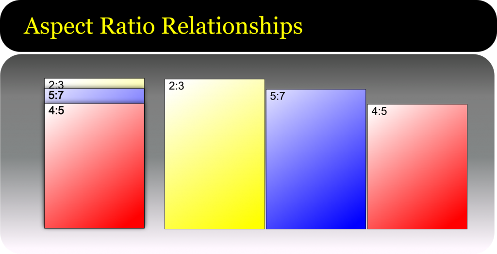
The answer is all in the colon. No, not THAT one, this one ==> :  These two quiet dots carry the full weight of the answer to the problem and it comes in the form of proportions.

Proportions, or “aspect ratios” are really just the comparison of one dimension to the other , ie. how height compares to width.  When the proportions of your image, match the size you want to print, we say that it “pros out”.  If it does not match we call this “fails to pro”. Pro, of course. being short-hand speak for “proportions.”

Proportions are used for many purposes in the graphic and photographic arenas, sometimes for technical reasons i.e. to fit a print size, sometimes for aesthetics – each ratio has its own gestalt – or feeling.

Images have their aspect ratios determined by either the camera or the cropping. For the purpose of our discussion, we are determining ratios to know if we will need to crop our image more to get it to fill all of a given print size.  Cropping is required if the image aspect ratio does not match the print size aspect ratio.

Proportions are written as two numbers separated by a colon, such as 1:3 – meaning that for every 1 the other gets 3.  So a print that is 1 inch on the shortest side would be 3 inches on the other side. Or an images that is 4 inches on the shortest side would be 12 on the other.

Note: officially when you verbally state a ratio, that little colon would be substituted with the word “to”, as in a ratio of 1 to 3.   Now say this out loud: “1 to 3”. Sounds like you just counted to three right? Welcome to english where we have two too many toos to go around. Since a great deal of our customers are from around the globe, and we don’t want to risk confusion in a print order, we prefer to use the word “by” instead. As in “a 4 by 5 aspect ratio”.

Image Size Calculator

Enter in your pixel width, height, and resolution to get your print size.  Minimum recommended print resolution is 75 to 150 px/in depending upon the quality and subject matter of the image.

The Basics

The aspect ratio is determined by reducing dimensionA:dimensionB to the lowest common denominator. Most print sizes will divide by 2 or 3  A few simple examples are a 4″x6″ print and an 8×10″ print.

Finding the ratio of the 4×6 would look something like this:

4×6 = 4:6 and the smallest number that these numbers can be divided by is 2.

4/2 = 2  : 6/2 = 3  No other whole number division can occur, so our aspect ratio is 2:3  or “2 by 3”

The 8×10 would go something like this:

8 x 10 = 8:10

Neither number divides by three down to a whole number, but we can divide equally by two.

8/2 = 4  :  10/2 = 5  No other whole number division can occur, so our aspect ratio is 4:5 or “4 by 5″

Let’s add another example: the 16×24 print size.

the 24″ dimension divides equally by three (3×8) but the 16” dimension does not (16/3= 5.33333) so we’ll try dividing by 2:

16 / 2 = 8 : 24 /2 = 12 and we get 8:12. We can take this further, yes?

8 / 2 = 4  :  12 / 2 = 6 and now we have 4:6 and we can still go down further.

4/2 = 2  : 6/2 = 3  No other whole number division can occur, so our aspect ratio is 2:3  or “2 by 3″

Now you might recognize that last one as the same ratio we determined from the 4″x6″ print. So our 4×6 and our 16×24 all have the same 2:3 aspect ratio. This means that an image that  fits our ratio will scale to either size print without the need to crop off image area.


Some print and image sizes might need to multiply up to get to a good whole number. Let’s take a 2.5″ x 3.5” print – commonly called “yearbook wallet size”.  These dimensions will not divide by the same amount to reach a whole number, so we must go up.  Again, I’ll use the 2 or 3 rule first.

The number two looks like a good fit here:

2.5 x 2 = 5 : 3.5 x 2 = 7 for an aspect ratio of 5:7.  These numbers won’t divide down further so we  have our final aspect ratio.

Now that we have an aspect ratio, let’s look at what print sizes this will match without cropping:

5:7

x2 = 10″x14″

x3 = 15″x21″

x4 = 20″x28″

x5 = 25″x35″

etc.

These are not very recognizable sizes today, in part because this aspect ratio has not been used in cameras for several generations. The 5×7 print size still exists, but it does need some cropping for most modern images.

So let’s try this with our other sample aspect ratios:

2:3 is the ratio of 35mm, most DSLRs and digital hand-held cameras in the consumer market. Since it’s likely one that most of our readers will have had some experience in, let’s start there.

2:3

x1  = Standard wallet – 2″x3″

x2 = 4″x6″ – Your basic minilab/drugstore print

x4 = 8″x12″ – A common portrait print size. Note that an 8×10 would need cropping

x8 = 16″x24″

x10 = 20″x30″

x12 = 24″x36″

etc.


In this next example you’ll see some very familiar sizes.

4:5

x2 = 8″x10″ The single most popular enlargement size in the USA.

x4 = 16″x20″

x6 = 24″x30″

x8 = 32″x40″

etc.

PhotoPrintAspectRatioComparisons

Let’s answer a common question:

How do I know how much of my DSLR file will need cropping to fit a 16×20 print?

This is pretty straight forward. Let’s start with the short dimension.

So we have a 16X20 print and a file with a 2:3 aspect ratio.

Divide the short side of the print by the larger of the ratios: 16/ 2 = 8

Take the result and multiply by the longer: 3 x 8 = 24.

Result of 24 minus the print size of 20 and the remainder is 4

So this process shows us that if we enlarge the file to fit the short side to the 16″ dimension, we will have an extra 4″ of image area that will get cropped from the long dimension.

If the last step of the equation leaves you with a number that is smaller than the print size, then you need to begin again, this time starting with the longer print dimension.


Whew!  Still have questions? Ask them in the comments below and I’ll do my very best to answer them.


Giclee Fine Art Printing – Getting a Great Print Part 1 – Photography of Artwork

A Pigment print is a bit more than just an inkjet print. So what makes it fine art worthy? To qualify, the print must be achieved using archival grade pigmented inks on archival grade fine-art paper or canvas. While we love the look of the watercolor papers and canvas papers we don’t suggest using Giclee “photo papers”. For aesthetic reasons, we recommend that the artist get a fine art photographic print for that. But the quality of the fine art pigment print is not limited to the inks and papers you use. There is quite a bit more that goes into the craftsmanship than just the print alone.

There is a great many details that should be tended to, but the major areas can be broken down like this:

Photography of your artwork
Working the file before testing
Generating a worthy test print
Working the file again to refine the proof
Printing the final units or series

Each of these is important to understand so they may become an effective part of your workflow. Since there is a great deal of information to pass along,  I’ll split the content into a multi-part series.

Photography of art work

Every step in the production chain of your fine art edition is critical, but some steps, if improperly done, can be disastrous to the final viewer experience. The first step, photography of your artwork, is an excellent example. This step is the largest determining factor to the faithful reproduction of your original art. To create a great pigment print, the photography of the artwork should be:

  • Focused properly using high-end lenses
  • shot using a strudy tripod in a vibration free environment
  • photographed using the sweet-spot of the lens
  • in some cases, polarized light and or special lens filters may be required
  • exposed correctly with a critical attention to detail
  • evenly lit using the proper lights
  • correctly white balanced
  • shot in the proper file format and with sufficient resolution
  • shot in a colorspace that is large enough to capture the full range of the painting and supports the full range of the Pigment print

The right glass

Shooting with inferior lenses may result in various distortions, such as smearing around the edges, chromatic aberrations – where some colors focus differently than others, barrel or pin-cushion distortion, lens flares and overall lack of saturation and/or contrast.  Shooting with prime lenses and pro-level equipment will provide the highest possible image integrity and result in a file that achieves the closest honesty to the original.

Image courtesy of https://upload.wikimedia.org/wikipedia/commons/thumb/4/47/Lens6a.svg/200px-Lens6a.svg.png

Chromatic aberrations of cheaper lenses result in out of focus images with color fringing.

Image courtesy of https://upload.wikimedia.org/wikipedia/commons/thumb/9/91/Apochromat.svg/200px-Apochromat.svg.png

Proper apo-chromatic focus results in all wavelengths (colors) focusing on the same plane for maximum sharpness and detail.


Image courtesy of https://upload.wikimedia.org/wikipedia/commons/6/66/Chromatic_aberration_%28comparison%29.jpg

Bottom photo clearly shows effect of apo-chromatic aberrations.

Distortions, or bending of the image are another issue with lesser quality lenses with “pincushion” and “barrel” being the most common. Pincushion distortion has the effect of the center of the image being further away than the edges while barrel distortion is just the opposite. With barrel distortion, the center of the image appears closer to the viewer than the edges.

Image courtesy of https://upload.wikimedia.org/wikipedia/commons/thumb/5/5b/Pincushion_distortion.svg/200px-Pincushion_distortion.svg.png

Pincushion distortion created converging lines towards the center of the image

Image courtesy of https://upload.wikimedia.org/wikipedia/commons/thumb/6/63/Barrel_distortion.svg/200px-Barrel_distortion.svg.png

Barrel distortion creates diverging line near the center of the image


A quality image capture is not dependent exclusively on a good camera/lens combination.

A high quality pro level tripod is a must for the artist who is serious about photography of art

A high quality pro level tripod is a must for the artist who is serious about photography of art, and they are expensive.

All elements in the photographic process are important. For example: how the camera and art work are handled during the exposure process will add a measurable difference to the final product.

A good solid vibration free tripod is a must-have if you are serious about photographing your own work.  Any vibration in the camera or the original artwork during exposure will result in “motion-blur” that will visibly carry over to your reproduction prints. While lesser tripods may be appealing just because of their price, they are susceptible to vibration, “ringing”, sagging and slipping during exposure. Think of it this way, if cheapo gear would lead to professional results, then why would there be a need for “pro” gear, and why would the pros invest the top grade gear?

If you want to get the best looking print, and your are committed to doing your own photography of your art do yourself and your art buyers a big favor and use the gear that will get you fine art quality instead of drugstore quality.

A stable support for your artwork is equally important. Any movement in your art during exposure will result in motion blur issues that will leave the image looking out of focus or double-exposed. While it may be tempting to take your art outdoors for the photo session, keep in mind that your painting is much like a sail in the wind. The slightest breeze will result in movement in the artwork. Heavier breezes or gusts may damage your art. And shooting with only one light-source, such as the sun, does not provide even lighting across the entire painting. I know this sounds crazy, but it has to do with what is called “angle of reflection” This is basically a measurement of the angle the light-path takes as it reflects away from the subject towards the viewer or camera and it is always equal to the angle of incidence (the angle the light path takes to get to the subject).

The propensity of light falling on a subject will reflect away at an angle equal to that of it's source.

The propensity of light falling on a subject will reflect away at an angle equal to that of it’s source.

Light falling on your canvas is more likely to scatter in a direction away from the light source. So let’s take the example to the right. The light source, in this case the sun, is to the left of the painting and the camera is directly in front of it. As we move across the canvas from left to right, we have less light reflecting in the direction of the camera lens. This results in the right side appearing darker than the left. This is called “fall-off”. Our eyes and brains adjust for fall-off for us, so we tend not to see it with the naked eye. While much of the light will “scatter” off in multitudes of directions, it is not enough to eliminate fall-off.

Since our light source is high and to the left of the subject, the brightest area will also be high and to the left.

Since our light source is high and to the left of the subject, the brightest area will also be high and to the left.


Shooting indoors gives you the greatest control over your environment for lighting and stability. When possible, setup your tripod on a concrete floor. Wood floors have flex and tend to amplify vibrations like a spring-board. If you must setup on a wooden floor, try to locate the load bearing supports under the floor and set your tripod in that area to minimize vibration. The farther you are away from the supports, the more amplified the vibrations.

Stay tuned for the next post in the series on Proper Lighting and Exposure. You can subscribe to our newsletter or via RSS to be notified automatically.


Professional Drum Scanning – What You Need to Know to Be the Smartest Person In The Room

Drum Scans

Color space is determined by the methodology used to create the colors within a file. The most popular of those are:
RGB
CMYK
LAB or a similar space such as YCC
RGB is gaining popularity in the graphics output community. RGB colors are “mixed” using values stated in levels instead of percentages. i.e. 0 to 255 rather than 0% to 100 %. This colorspace can be thought of as a “Transmissive” colorspace as RGB devices use light to image instead of pigments. As your levels increase towards 255, your values get lighter.
Black, medium grey and white in RGB are created from the following mi

Black Medium Grey White
RGB RGB RGB
0 0 0 127 127 127 255 255 255

As you can see, the closer to white (more light) the higher the number.

RGB is a “Device Independent” colorspace, meaning that regardless of the device printed to, a given color in a file will always be made of the same color “mix.”

CMYK is a long standing “standard” but is not a device independent colorspace. This is due to the many variables in the CMYK world. GCR (Grey Component Removal) and UCR (Under Color Removal) can result in the same perceived color being reproduced with several different combinations of Cyan Magenta and Yellow, depending on the level of the Black. These mixes are determined by paper stock, press conditions, inks used, etc. One CMYK file built for a web press, can yield drastically different results when sent to a sheet-fed press, or an inkjet printer. Each of these devices prefers different levels of GCR, or UCR. Creating a CMYK file for one, does not mean it will perform as expected on the other. Because CMYK files are “calibrated” to a specific device, they are referred to as “Device Dependent”. CMYK values are measured in percentages from 0% to 100%. The higher the number, the more ink is laid on the paper during printing. Because each press and paper combination can yield different results, there is no exact formula for a rich black, middle grey, or any other color except for “paper white” which is:

White
C M Y K
0% 0% 0% 0%

There are several formulas that are used throughout the industry as approximate guidelines. These can be obtained from your printer.

Our Professional Drum Scanning is provided in a RGB colorspace file unless otherwise requested. All scanners actually see in RGB, but a CMYK scan is converted on the fly through either hardware or software algorithms. By providing you with an RGB scan, we are allowing you or your service provider to convert the file to CMYK based on their individual requirements, leading to a higher quality product

.

How to Setup Your Digital Files

We want you to have the best possible photographic print or fine art reproduction with the least amount of difficulty. For an engaging experience with outstanding results, simply follow the instructions below!

Recommended Working Color Spaces

While we suggest that you convert to profile for all large format prints (LightJet and Giclee Pigment Prints) we provide you the freedom to submit your files in any color space you prefer. The table below shows our recommended working spaces.

GicleeLarge Format Photo (LightJet prints up to 49x120)Enlargements and Proofs (Frontier prints up to 12x18)
Recommended Working Color SpaceAdobe 1998 or sRGBAdobe 1998 or sRGBsRGB

A note on filenames

  • File names must have the appropriate .tif or .jpg extension and must not contain characters such as: \ / :*?”|’~ $ spaces right before the period, bullets or foreign characters.

Monitor Calibration and Color Profiles

  • Let’s start with how you see your digital files. Every monitor is different and changes over time. It’s important to keep your monitor calibrated and as close to output reality as possible. The purchase of a quality colorimeter is a good investment.
  • We calibrate our production displays using the X-Rite i1 Display 2 colorimeter. Our monitors are set to a gamma of 2.2 and a color temperature of 6500k. We use Daylight balanced (5000k) illumination for color assessment unless you request otherwise. This excludes backlit trans, which use an industry standard of cool-white.
  • The best prints come from the best digital files. No amount of profiling will accurately compensate for poor exposure, over-worked corrections or inaccurate color. Profiles merely help with attaining a print that is truer to the actual content of the file. We strongly recommend using a properly calibrated display with the correct working space/output profile combination for a given printer or device. If you want to learn more: Color calibration information is available by clicking here.

Turnaround

  • All instructions must be written legibly, verbal instructions will not be exclusively accepted. When supplying a file for output, job turn around times begin on the first business day when we have received all required elements to complete the job.
  •  Compress (zip archive) your fonts if you are uploading your files, or convert your text to outlines.

Please include:

  • All screen and printer fonts
  • Linked files
  • A hard copy layout with a color reference if applicable. For uploaded files, please include a client approved PDF.
  • Provide images in the proper color space as listed for each device.
  • Lightjet – converted to our output profile, or in a working space such as Adobe 1998 or sRGB
  • Failure to properly set-up and include all necessary files MAY DELAY YOUR JOB! Any production time required to correct set-up errors, improper color-space, incorrect file type, proportions etc, may result in intervention charges billed at a $60 set-up fee, plus applicable hourly rates. All output pricing is based on the size required to print all data in your layout, including crop-marks, registration marks and bleed. Because we use a multi-platform network, it is imperative that file names be fully cross-platform compatible; no punctuation or extended characters such as bullets, trademark, slashes, dollar signs, commas, etc. Hyphens and underscores are acceptable.

Programs

Our Fuji-Frontier Mini-lab only accepts .jpg and .tif RGB files (sRGB is preferred for the most predictable color). Layout files and or PDF are not printable on this device. Please convert your files to .jpg or .tif before submitting for small format printing.

For large format printing, we accept files from the most current versions of the most popular professional graphics and layout programs listed below. If you are using a different program for your work please give us a call.

Adobe In-Design

  • .native, .eps, .pdf
  • RGB preferred
  • Please convert all text to outlines
  • All screen and printer fonts
  • Linked files
  • A hard copy layout with a color reference if applicable. For uploaded files, please include a client approved PDF.
  • Provide images in the proper color space as listed for each device.
  • Whenever possible, prepare your layout to final size of output.
  • If full size is not an option, please use a scaling of 50% or 25% .
  • If bleed is not included within the document area then it will not be printed.
  • If there is no bleed included, we will usually enlarge the print slightly to accommodate mounting.
  • Please inform us of the final document print size, so the job is not delayed while we contact you for that information.

Adobe Illustrator

  • .native, .eps, .pdf
  • RGB preferred
  • Please convert all text to outlines
  • All screen and printer fonts
  • Linked files
  • A hard copy layout with a color reference if applicable. For uploaded files, please include a client approved PDF.
  • Provide images in the proper color space as listed for each device.
  • Whenever possible, prepare your layout to final size of output.
  • If full size is not an option, please use a scaling of 50% or 25% .
  • If bleed is not included within the document area then it will not be printed.
  • If there is no bleed included, we will usually enlarge the print slightly to accommodate mounting.
  • Please inform us of the final document print size, so the job is not delayed while we contact you for that information.

Adobe Photoshop

  • Flattened, uncompressed tiff or max quality jpg.
  • Adobe 1998 or sRGB.
  • We reccomend converting to our profiles when applicable
  • Provide images in the proper color space as listed for each device.

Microsoft PowerPoint

QuarkXPress

  • .native, .eps, .pdf
  • RGB preferred
  • Please convert all text to outlines
  • All screen and printer fonts
  • Linked files
  • A hard copy layout with a color reference if applicable. For uploaded files, please include a client approved PDF.
  • Provide images in the proper color space as listed for each device.
  • Whenever possible, prepare your layout to final size of output.
  • If full size is not an option, please use a scaling of 50% or 25% .
  • If bleed is not included within the document area then it will not be printed.
  • If there is no bleed included, we will usually enlarge the print slightly to accommodate mounting.
  • Please inform us of the final document print size, so the job is not delayed while we contact you for that information.

Fonts

  • All screen fonts and printer fonts must be included or text converted to outlines.
  • DO NOT use keyboard commands for bold or italic fonts.
  • Use actual bold or italic fonts where applicable.

Layout

  • Whenever possible, prepare your layout to final size of output.
  • If full size is not an option, please use a scaling of 50% or 25% .
  • If bleed is not included within the document area then it will not be printed.
  • If there is no bleed included, we will usually enlarge the print slightly to accommodate mounting.
  • Please inform us of the final document print size, so the job is not delayed while we contact you for that information.

Color

  • All efforts will be made to approximate to your supplied color samples, however, due to the limitations of the different media, we cannot guarantee an exact match.
  • Color corrections that require more than global corrections will incur retouching charges. Items that we scan may require billable retouching time to match an original.
  • If a test must be approved before finals are hit, the finals will have normal turn around times, beginning from the time of approval for color.
  • If Pantone or process color matches are requested, we recommend calling so we can give you the closest equivalent color build for a given media.
  • All devices print differently, and different media on the same device may not produce the same results. An image corrected for one media may require additional retouching time to correct the image for another media.
  • Images supplied by the customer will be charged computer time to match color to a proof.
  • Remember, what you see on your monitor for color is not always a good indication of how the final print will look.

Proofs

  • If a proof is required, it will be done on the same device and media as the final print.
  • The proof will be the full image, printed to an 8″x10″.
  • If a strip test is requested at final size, there will be an additional charge applied.
  • If you require a proof after layout adjustments ie: text changes, image placement etc., we can email a PDF. If the files exceed 50 megabytes, we may print a screen capture of the layout. We will e-mail a PDF or screen capture free of charge.

Removable Media

We accept the following removable media:

  • CD-ROM/ DVD
  • Thumbdrive
  • Micro storage cards
  • You may also send you files via our web upload page.

LightJet – large format photo prints

LightJet Calibration Specifications and Profiles are available by clicking here.
Files submitted for LightJet output must be supplied:

  • In an RGB color-space
  • As non-compressed, flattened tiffs or maximum quality jpeg – no layered files.
  • Use of our profiles is highly recommended but not required.
  • At a minimum resolution of 150 ppi at 100% of final size.
  • For prints smaller than 20×24 it is recommended that the resolution of the file be closer to, but not to exceed 300 ppi. and rely less on the LightJet’s superior built-in interpolation.
  • The LightJet’s maximum resolution in normal mode is 300 dpi. For large prints from lower resolution files, we rely on the lightjet’s internal interpolation algorithms to achieve that final resolution.

Giclee Pigment on Canvas and Watercolor

  • The Pigment printers will print up to a 60 x 120 inch image area on a maximum paper size of 60 inches wide.
  • Watercolor paper or canvas,
  • Raster Images should be supplied at a minimum resolution of 200 ppi at 100% of output size as RGB TIFF- Adobe 1998 or sRGB.

Fuji Frontier Mini Printer for prints up to 12×18

The Fuji Frontier Digital Photo Printing Minilab accepts files in the following formats:

  • sRGB 8-Bit Tiff (no LZW)
  • sRGB 8-Bit Jpeg
  • Greyscale 8-Bit Tiff (no LZW)
  • Greyscale 8-Bit Jpeg
  • File names must have the appropriate .tif or .jpg extension and must not contain characters such as: \ / :*?”|’~ $ spaces right before the period, bullets or foreign characters.

Learn about Tiff versus jpeg. Does Size Really Matter?

Is Bigger Always Better?

men on a very large bicycleYou are probably frustrated with the Tiff vs Jpeg debate. The truthful answer is not one of always use this, or never use that.  Like cars versus trucks, they each have attributes that make them well suited for certain tasks and not others. Often we are asked to describe the difference between tiff and jpeg files. While they share a few similarities, there are a few differences and particularly some characteristics in the Jpeg format that any individual looking to get the very best image quality should know.

A Tiff file (Tagged Image File Format) and a JPEG file (Joint Expert Photographic Group) are both raster file types. A raster is a grid, and raster images have their pixels (picture elements) arranged in a grid pattern – like a chess board with a large number of squares, with each square being assigned a color and density value. When the squares get small enough that our eyes cannot see them individually, they blend together to create the image.

Both file types contain what is called “Meta Data”. Meta originates with the Greek language and means beyond or above. So meta data is information that is above or beyond the “normal” data in the file. In this case, the data that forms the image. This meta data may contain image relevant information such as what color space the file is in, what embedded or assigned color profiles are of note, the actual file type – tiff or jpeg, image dimensions in pixels and inches/cm, a thumbnail preview and some pertinent info that software uses to rebuild our image file from the raw data. This meta data may also contain additional extended information that is not used to display the file, such as the type of device used to capture the image, i.e. what camera or scanner, exposure settings, flash settings, date, time and even GPS co-ordinates and copyright information if available. This list is not intended to be a complete technical description, but just enough info to give you a general idea.

JPEG files use a variable compression scheme to throw information away, thereby allowing the stored image file to require less file size. Jpeg compression is fairly intelligent. The software throws data away to save space, then the application that opens the file uses information embedded in the file to “rebuild” what the lost data might have looked like. The more data that gets discarded, the less there is for the software to base it’s rebuild on and we begin to see anomalies, or what are called “artifacts”. The authors of the JPEG standard knew that the human eye is far more sensitive to density information than it is to color. So color information sees the most loss of detail. Maintaining as much density information as possible here is key to keeping as much quality as possible. While this does effect color-detail, this process is nicer to look at than throwing out the density detail. Our eyes are less likely to see a smearing of the color than smearing of the detail. At higher levels of compression, more information is discarded, including more of the density detail, resulting in an image that looks blurry, or grainy. Some applications such as The GIMP – http://www.gimp.org/ – allow the user flexibility to increase compression in the color only, and leave the detail alone, thus allowing for a bigger bang for the compression buck. One of many nice GIMP features that Adobe could learn from.

Mid Level CompressionLow Quality-Maximum Compression

Max quality - Minimum Compression


Jpeg likes to work in 8 pixel by 8 pixel blocks and any one block has no idea what the next block contains. This can result in the borders of neighboring blocks failing to match for color and density. As levels of compression increase, these blocks become increasingly apparent to the viewer because the “rebuild engine” in the software has less original information to work with and therefor errors will be greater.

The tiff standard had it’s birth in the desktop publishing world as a proposed standard amongst desktop scanning devices. It is widely accepted as one of the image format defacto standards for printing and publishing. The other being EPS. Many consider tiff to by synonymous with uncompressed or lossless compression. This is a false assumption. While the baseline (basic level) of tiff is either uncompressed or uses a lossless line level compression, a tiff file can also be a “container” for a jpeg compressed file. This jpeg-in-a-tiff scenario is subject to all the loss and limitations of any other jpeg file. So be aware that a file with a .tiff extension may not have all the integrity you are expecting.

Tiff’s early days were very limiting. The format supported only 1 bit of data per pixel – meaning black or white. No gray and no color. Over the years the tiff standard has expanded to support ever increasing bit depths and files up to 4 gigs in size. Files over that size use a format called Big-Tiff.

Just in case this whole file comparison thing is not quite “geeky” enough for you, here is a fun fact; The third and fourth bytes in a tiff file alway represent the number 42, which is a nod to “The Ultimate Answer to the Ultimate Question” in “The Hitchhikers Guide To The Galaxy” http://en.wikipedia.org/wiki/Phrases_from_The_Hitchhiker%27s_Guide_to_the_Galaxy#Answer_to_the_Ultimate_Question_of_Life.2C_the_Universe.2C_and_Everything_.2842.29

And they say programmers don’t have any fun.

The tiff standard has been expanded to include support for multiple “pages”. Just like a layered photoshop file. Adobe, who owns the rights to the tiff format, have taken advantage of this flexibility and allow layered photoshop files to be saved in the tiff container, alongside a “flattened” version of the file so that standard tiff reading applications can provide you with a usable composite image.

So I hear you asking: “Which one is best?” This of course depends on your needs. For general photographic and fine art pigment printing, file quality is a majority factor in the final print. Lossy compression means less than stellar printing. So use jpeg if you must, but compress it as little as possible. If you are using tiff, if you must compress, avoid using jpeg compression and go with line level compression. LZW for example.

Now if maximum quality is your biggest concern. Stop shooting JPEG in your camera, unless your raw files are compressed too. Many manufacturers only provide compressed raw.  Check your camera specs. If you aren’t gaining anything by shooting raw, then go for JPEG and save the space. If you have an uncompressed raw or a tiff option, these will yield the best file integrity but take the most room in storage.

If storage space is your primary concern, then jpeg is your friend, at least until camera makers are willing to include lossless compression in their firmware, and it is unlikely they will until there is a demand for it. So if you think it’s a good idea, write your manufacturer and request it.

Want more on shooting Raw vs Jpeg?  Check out my blog post on that topic here

Have a question? Put it in the comments below!


How big can I print my file?

Here is another great question we hear quite often. Sometimes more than once a day. So it seems low resolution file showing pixelsa relative bit of information to pass along here to our blog reader friends.

There are two valid answers to this, depending on whether we look at this as a relative issue or a subjective one. As a relative issue, we use math to compare number of file pixels versus output resolution. Subjectively we look at quality as simply a matter of personal taste – what I like to call “The quality to pain threshold”. Or how big can we go before the quality drops to where it becomes painful to look at or pay for.

First, in either point of view, image quality is more than just the number of pixels contained in the medium resolutionfile. For a simple example; a modern 24 mega-pixel file shot out-of-focus will be of lesser quality than a properly focused 4 mega-pixel file.

Let’s look at the relative approach first, since most folks like easy and firm answers, such as 2+2 always = 4, and George Washington was the first US prez.

The easy answer is achieved with simple math:

File pixel dimension ÷ minimum input resolution = output dimension.

Consider this:
The example camera has a pixel dimensions of 2000×3000 (6 mega-pixel)
and the example device wants a minimum of 300 ppi (pixel per inch) file resolution.Full resolution file uncropped

2000÷300 = 6.66″
3000÷300 = 10.00″
The largest maximum quality print size would be: 6.67″ x 10.0″

If your printer recommends a minimum of 150 ppi:

2000÷150 = 13.33″
3000÷150 = 20.00″
The largest minimum quality print size is 13.33″ x 20″

If your file is from a 24 mega-pixel camera with dimensions of 4000×6000:

4000÷150 = 26.66″
6000÷150 = 40.00″
The largest minimum quality print size would be 26.66″ x 40.00″

With the subjective approach, there are limited fixed answers. The size of output is usually limited by one or more of the following factors:

* The physical limitations of the printing device.
* Your budget.
* How ugly you are willing to accept it.

At some point the cost of the print will break your budget. That is a hard and fast limitation. So that’s easy – you can print as big as you want to go as long as you can afford the print.
The printing device or medium will support a maximum specific size. For instance, some ink jets will not print any larger than 40″ wide, but they will go several hundred inches long. You can’t go any larger unless you pick a different printing device or you print in multiple tiles and deal with matching the seams. If you are willing to do the latter, then your budget is again your limit.

The subjectivity comes in with your opinion. How big is too big before the quality drops below your level of acceptance – your threshold of pain. Or you might call it the “Yuck factor”. When you get to a level of enlargement that degrades the quality to a point where you don’t like the results, you have hit your threshold of pain. In essence, you see the print and say “Yuck! That’s one ugly print and I’m not willing to pay money for it”

What does the yuck point look like? I can’t answer that for you, only you can. My level of acceptability may be different than yours. A professional’s need for quality is likely higher than that of the average consumer due to experience and training. Because of this experience, the professional will usually hit his/her level of pain sooner than the consumer.