This short basics post will prime you to understand how colors are specified in digital files. In the reproduction market, of which Reed Art & Imaging is a part of, we use digitally driven devices to make faithful reproductions of original art, photographic captures and digital graphic designs. To accomplish this task with any hopes of repeatable accuracy, there must exist a standard system by which colors can be recorded, transferred, translated and output. These standards exist in theoretical color models. These models are a virtual shape, such as a box, sphere. polygon or other shape that if it were real, would contain every color visible to the human eye.
![By SharkD (Own work) [GFDL (http://www.gnu.org/copyleft/fdl.html) or CC-BY-SA-3.0-2.5-2.0-1.0 (http://creativecommons.org/licenses/by-sa/3.0)], via Wikimedia Commons](https://upload.wikimedia.org/wikipedia/commons/a/af/RGB_color_solid_cube.png)
The RGB color model mapped to a cube. The horizontal x-axis as red values increasing to the left, y-axis as blue increasing to the lower right and the vertical z-axis as green increasing towards the top. The origin, black, is the vertex hidden from view.
Because the model is represented by a shape, they are referred to color “spaces”, for the space the object would occupy in the theoretical environment of
all colors – visible and invisible. The graphic above is an example of a space that uses Red, Green, and Blue to yield the final color we want to create.
Colors come to our eyes in two ways – or transmitted from a light source or reflected off of a surface.
RGB is called the “primary” space and it’s numerical system can be equated to the brightness values of transmitted light – or how intense the Red light, Green light, and Blue light are shining. As the numeric value increases, the lights get brighter and the closer to white they become. More on that in a bit.
In a CMYK model (the secondary space) we are representing pigments that absorb light. So as the number increases in their scale, the more light is absorbed. So with CMYK, the higher the number, the darker the color appears – exactly opposite of RGB.
In either space, the ratio of how the colors are blended determines the color, while numeric values contribute to how bright or dark it is.
For simplicity, the rest of this article will use only one color model. I’ll use the RGB model for these examples because it’s the model that our clients use and best supports high-end reproduction digital printing.
How Color is Expressed
Color is usually expressed in human terms by it’s
- Value (light to dark)
- Saturation (how close to pure is it)
- Hue (red, purple, green, yellow, orange, etc.)
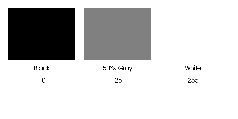
In the data driven world, it’s expressed as a recipe of the colors required to build its final value, saturation and hue. Image and graphics applications usually use the standard scale of 0-255 ( what is called 8-bit color) to represent the amount of each color present, with 0 being none and 255 being maximum. Dark colors being closer to 0 and light colors being closer to 255. Equal amounts of each color create neutral hues ( grays ) and as the numbers increase from 0 to 255 the value moves from black to white.
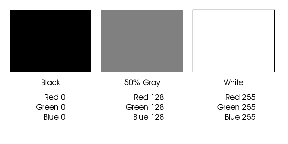
Darker values are closer to zero and lighter values are closer to 255
These numbers from 0 to 255 are called “Levels” and in our examples fall into a model of 256 levels – with zero being included as a level. In an RGB color space, each color is built using various levels, or recipes, of Red, Green and Blue. Dark Red has a different recipe than Light Red, and the recipes are different for a saturated versus less saturated red.
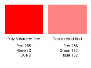
Fully saturated red is a different build than a less saturated red.
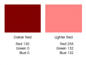
Dark Red has a different build than Light Red.
As you can see in the first example above, a fully saturated hue has 255 of it’s requisite colors and none of the other colors. As the color desaturates, it gains some of the other colors; it’s moving closer to a neutral gray. In the second example we can see that the Darker Red contains none of the other colors, but the Red number is dropping closer to zero; thus making it “blacker.” This darker red is as saturated as it can get at this present value.
A critical point to understand is that in an RGB or CMYK file, color and density are inter-connected. Meaning that any change you make to color data will result in changes to density and visa-versa.
The other primary colors are built in the same way, like this:
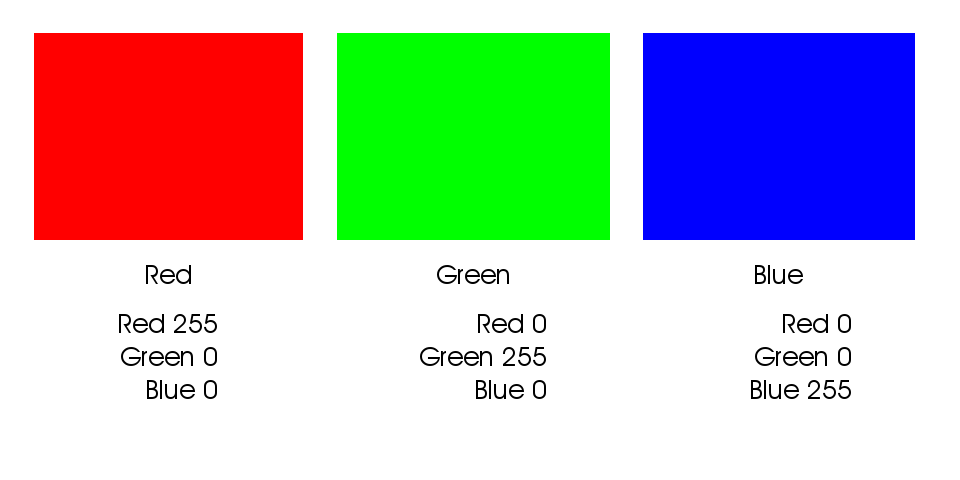
Color builds of fully saturated Red, Green and Blue.
The secondary colors are built from equal amounts of two of the three colors:
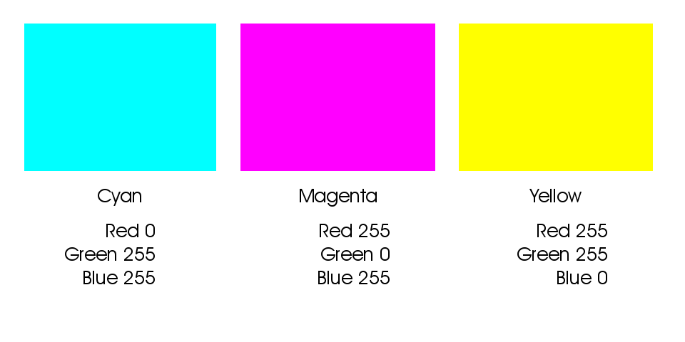
Secondary colors are built from two of the three colors
These secondary colors are thought to be the “opposite” colors to those in the previous example. You will notice their recipes are directly inverse. Red is R255 G0 B0 and Cyan is R0 G255 B255. They are opposites because when the two colors are combined, they cancel each other out and make gray. Equal parts of Red and Cyan make gray, same goes for Green with Magenta, and Blue with Yellow.
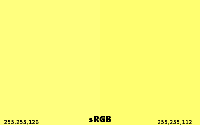
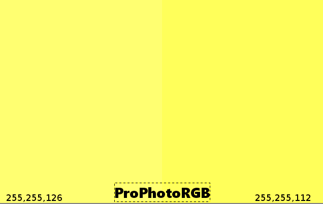
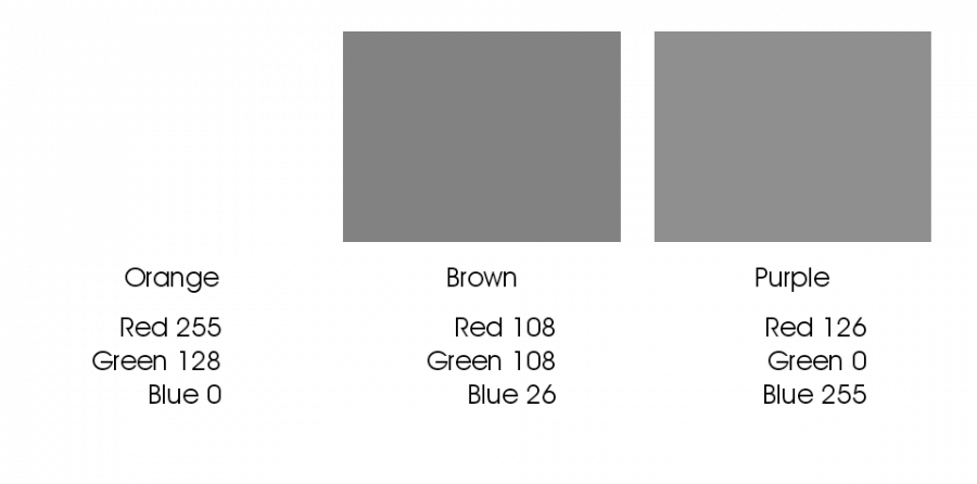
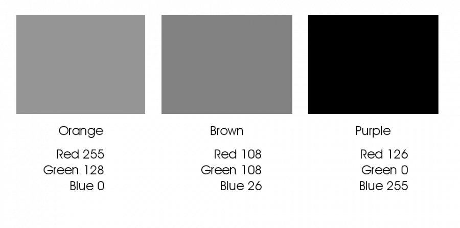
Intermediate colors such as Orange, Brown, Purple, Daisy Yellow, Lemon Yellow etc. are built by using various values of the three colors where at least one of the colors is greater than 0 and less than 255:
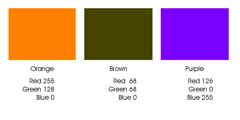
Intermediate colors result from builds using two or more colors.
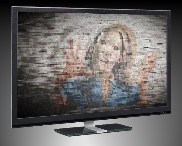
This 8-bit model, using it’s 256 level per color channel architecture allows for approx 16.7 million variants of color and density. (256 x 256 x 256 = 16,777,216).
Other bit-depths exist that extend the number of available colors; the concepts are the same, but the numbers differ.
For example: 12-bit color – the depth that most digital cameras record in raw format, has 1,728 levels per color channel (instead of 256) with a total number of 5,159,780,352 available colors, much higher than present technology can reproduce in a print or display. The commonly used 16-bit depth has 4,096 levels per color channel with a total number of 68,719,476,736 available colors – yes that’s 68.7 Billion! While some professional pigment printers and their RIPs can support a 16-bit file, getting the subtleties from that many colors on paper and dots via a limiting 8 to 12 different ink colors is still problematic.
If you have questions, post them in the comments below. If you want to see how this all ties together with Photoshop channels, stay tuned, that’s next!
 perpendicular to the paper, a perfectly round laser dot across the entire image area. The result is maximum sharpness and detail across the entire print – corner to corner, edge to edge.


 The rising star in online networking is the Google Plus Hangout On Air, or HOA for short. This medium mixes the experiences of video conferenceing, webinars, screen sharing and chat all in one easy-to-use package. The affordable (can you say free?) tool also comes with the added benefit of increasing your SEO, your personal brand and the leverage of your YouTube channel.
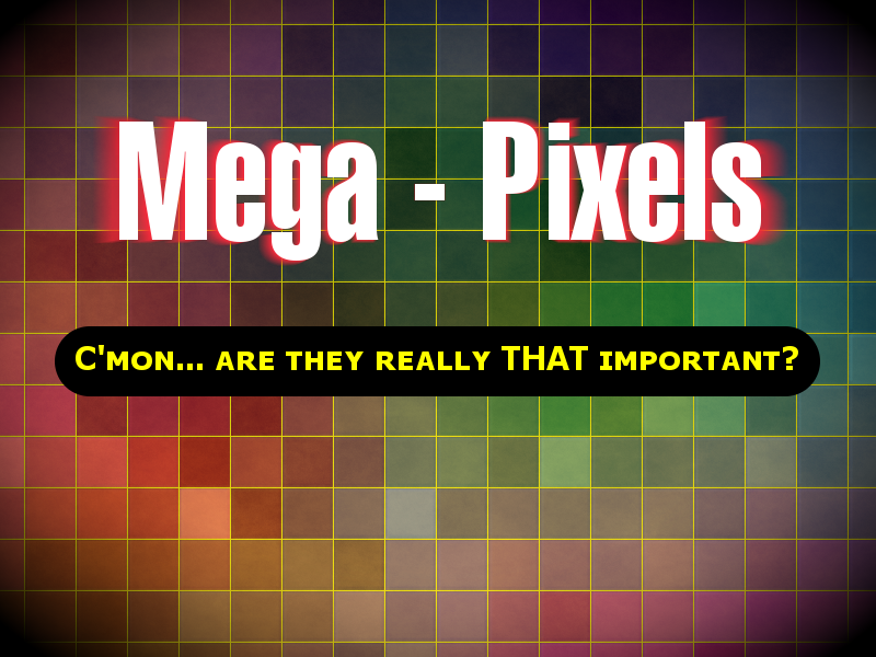
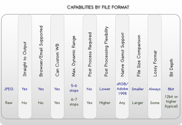
 The folks over at the Independent JPEG Group who have the job of maintaining all things technical behind the JPEG file format have added some much needed support to the oft-maligned aging file-type. With the release of version 9 of the jpeg software libraries comes 12-bit color support and optional loss-less compression; after all it wouldn’t do much good to have 12-bit color if you lose so much color-fidelity in the compression process. For the true geek in all of us, the new libraries are available for download should you want to try your hand at implementing them into your workflow. Be warned though, that unless you have some serious skills, implementing them in existing software will be a challenge. Open source fans on Linux and MacOS have the best shot at implementation at this time. You can grab the codec files from
 .png)