Begin with a calibration system in your studio.
Accuracy begins with the state of calibration of your computer, it’s monitor, and the neutrality of your viewing environment. The idea of profiling is to make your monitor “Honest” in it’s representation of the file. The reason to profile often, is to maintain the display’s honesty so you get predictable results job after job. An inaccurate or improper calibration of your monitor will yield inaccurate, inconsistent and unreliable results. We recommend the use of the X-Rite i1 Display 2 colorimeter :
Monitors :
Think about buying the absolute best display you can afford. Your monitor is your representative to the contents of your file. Higher gamut and accuracy in your display, combined with proper display calibration (profiling) means greater accuracy in your final product. Stick with a good name in displays such as Eizo, NEC or LaCie and look at spending at least $600 for a good display. Technology is changing constantly so be sure to do your research in the color management forums on the internet before buying. Stay away from used displays since the expected professional life span of the display is around 30 – 40 months. As displays age, their available colors (gamut) and their contrast-range diminish below professionally acceptable levels.
And please: no laptop displays for color correction. They are inconsistent, even when profiled.
Your Viewing Environment:
Daylight balanced illumination is not just a good idea, it is a must. Bulbs that spec to 5000 Kelvin with a color rendering index (CRI) of 98 or better. Either florescent or tungsten bulbs can be used, but not just any daylight bulbs will do. For florescent, look into GE Chroma 50 and Solex for tungsten bulbs.
Your walls should be a neutral color, as should as much of the rest of the environment as possible. It’s a great idea to wear neutral clothing. I know this sounds a bit much, but pro lab techs have known for years how clothing (and diet) can effect your color perception.
Give your monitors and your eyes time to acclimate. Allow your monitors a few minutes for the electronics and the panel to come to a stable temperature before doing calibrations or any color work after calibrating. It’s also a good idea to give your eyes a chance to acclimate to the room, especially if you are entering from a room with different lighting or from the outdoors.
Always, always check with your lab for the proper color space for your files.
You have probably heard Joe “The Guru Photographer” tell you to always do things such and such way, and maybe Jane “The Photoshop Queen” Tell you something similar or totally different. Those two, while knowledgeable, have always done it the way their lab tells them to, but they may be using different labs, who then have differing criteria for workflow. It’s no wonder so many people are confused at what to do, then baffled when their prints don’t meet expectation.
Neither Joe, nor Jane know what YOUR lab expects in the way of color space. Just like Joe and Jane, every lab has their own opinions of what is the best way to produce your work. There is nothing wrong with that, just different. Since there is no official standard, we all get to pick and choose. High volume production facilities tend to pick settings that will let them work faster, but not necessarily produce the best print. High quality reproduction studios like us should be using the color spaces that best match the device that outputs the print.You will find our colorspace suggestions below.
Something to watch for are labs that insist on forcing their client’s files through profiles. That means your files are being profiled without your permission and you may be completely unaware that it is even happening.
We don’t do that. While profiles can improve consistency between multiple types of printing equipment, they always alter pixels values and can damage the color fidelity of a file by causing banding and other artifacts, so we leave it up to you to decide if you want to subject your file to a profile conversion.
So here are the working color spaces we recommend when working with us. These working spaces most closely match the output devices ability to create color, and thus yield greater predictability – i.e. a closer approximation to your calibrated display:
| Giclee | Large Format Photo | Mini-Prints and Proofs | |
| Recommended Working Color Space | Adobe 1998 | Adobe 1998 or sRGB* | sRGB |
*acceptable but not preferred
- If Light Jet output is your goal, we suggest a working space of sRGB or Adobe 1998 and converting to our output profile.
- If you are submitting for Giclee, we suggest Adobe 1998 and no profiles.
- Our Fuji Frontier is designed to work in the sRGB space and should not need profiles.
| Download and install our color output profiles With the profiles downloaded, moving them to the folders below will make them available to photoshop and other color management aware applications. Mac OS X: \Library\ColorSync\Profiles Win 7, Vista & XP: \Windows\system32\spool\drivers\color |
|||
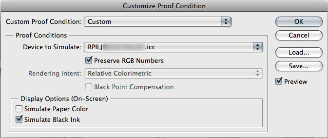
Softproofing settings:If you are adjusting your file based on what you see on your monitor, it is critical that your display be properly calibrated and you use the correct softproof settings for how you will be submitting your file.If you are sending in the working space(i.e.Adobe1998 or sRGB):
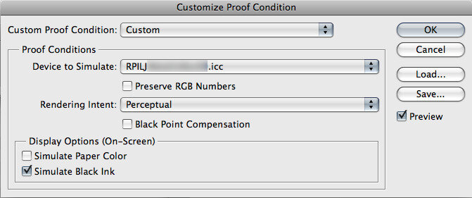
If you will be converting your file to our output profile prior to submission: ( edit>convert to profile)
|
Why Calibrate?
Quality, time, and money. You will get more of all three if your system is properly calibrated. You will need to start with your display system in a state of excellent calibration, and a set of our output profiles. These are available for download from our web site at https://reedphoto.com in the download section. Without great calibration, predictable results between your system and our calibrated printers will be very difficult if not impossible. With proper calibration and the correct color management setup, you should see on your monitor, a reasonable approximation of our output from your file.
Color space:
If Light Jet output is your goal, we suggest a working space of sRGB or Adobe 1998 and converting to our output profile.
If you are submitting for Giclee, we suggest Adobe 1998 or sRGB and no profiles.
Our Fuji Frontier is designed to work in the sRGB space and should not need profiles.
Have a question?
Our TrueArt™ Creative team is ready to help you. Fill out the short form below and a member of our team with reach out to you as soon as possible.
Add a Comment