The TL/DR Version for You Experts:
Need to knows:
- Calibrate your high-quality display using industry accepted device and software 100-120 cd, contrast not higher than 200:1, D65 whitepoint.
- For maximum predictabiltiy, use a working space that most closely matches your display: i.e. sRGB or Adobe1998
- Use a proper viewing environment for prints and the monitor.
- RGB: Tiff, Jpeg, PSD, or PDF are preferred.
- Minimum of 150ppi (up to 300ppi) at print size is preferred. No lower than 150ppi please
Soft proof settings in Photoshop when converting to profile:
- No black-point compensation.
- Preserve RGB turned off.
- Rendering intent of Perceptual
Soft proof settings in Photoshop when NOT converting to profile:
- No black-point compensation.
- Preserve RGB turned ON.
- Rendering intent will default to Absolute Colorimetric.
File Type and Resolution
Files should be in the Adobe 1998 or sRGB space at a minimum of 150 ppi at final size.
We accept flattened TIFF and JPEG files.
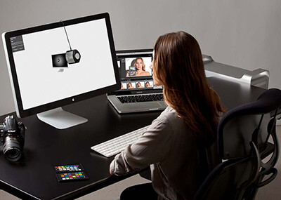
Step 1 is Display Calibration:
How and Why to Calibrate
What Display Calibration is:
Before you get started it’s important to understand that while display calibration is important, it cannot bring a substandard or low quality display up to snuff.
There are four processes that come together into what we call “display calibration.”
First is hardware based adjustments that get the monitors settings to as close as possible to the proper white-point color temperature, black point densities, and contrast. These are performed either by hand via buttons on the monitor, or via digital communication between the calibration software and the monitor (ADC)
The second step is called “characterization.” This occurs through a system where software presents colors on screen, and a device measures that color and reports back to the software. The software then calculates how far off the color on the monitor was, compared to what it should have been. These errors are mapped in the software for reference during the third step: the profiling phase.
A profile is a file that contains data such as the devices maximum limits for color saturation (gamut), white point color balance and brightness, maximum black, etc. It also contains data representing the errors/inaccuracies of the display for colors, their various densities, and for contrast. This profile is used by some types of color-management enabled software that might want to know how your display renders color so it can compare to what an image file actually contains. With the comparison in hand, the software adjusts what it sends to the display to provide you with a higher level of accuracy.
The fourth step is the Look Up Table, or LUT for short. This LUT is much like the color profile created in step three, but it loads into your graphics card while your computer is booting so that the card can attempt to do the opposite of the display’s errors, effectively cancelling them out. To simplify it; if your display is x amount too blue, the card will remove that same amount of blue to compensate.
The system does not read every color your card and display can render, just a very small portion of very specific colors. The remaining billions of colors are mathematically “guessed” by firmware or software. This guessing leads to errors, but hopefully these errors are closer to accurate than would have been with no calibration at all.
Why Calibrate your Display?
First, let me say: there is no easy button to get the best quality print. If you are expecting display calibration and profiles to give you a short-cut to the best print, you have been misled.
- Display calibration puts things in a know state of accuracy. When the display “drifts” or changes its characteristics ( they all do over time ) re-calibration can return it close to the previous know state.
- Soft-proofing profiles create a margin of predictability. This happens when the profile is applied in a way that allows you see an approximation of what the print might look like.
- Output profiles describe the characteristics of a printer or other output device. Profiles are sometimes used at the time of output in an attempt to adjust the colors of the print so it looks like the colors in your file.
Profiling gets you the most predictable output, not necessarily the best output. It’s not much different than using the “auto” mode on your camera. Auto exposure makes things quick and easy, but as you grow as a photographic artist, you discover how that easy button limits your control and potentially causes problems. So you may eventually embrace the harder method of manual mode when your goal becomes getting the capture that is most flexible for post processing, not just the easiest to shoot.
Monitor calibration is meant to make your display as honest as possible without introducing profile-related errors such as banding, into the file. An honest display is much like using better lenses: fewer errors to contaminate the resulting file.
No display is going to be 100% honest (accurate) even after calibration and profiling. The display is your window to seeing what the file actually looks like, so if the hardware is lying to you, how can you trust it to evaluate what the file actually looks like?
The only way to see with 100% accuracy what a file will look like when printed on a specific paper/ink/device combination, is to actually print it on said paper and device! Artist Proofs are a long-standing tradition in fine-art print-making that allow the artists and their print-maker to see with complete clarity what the start of an edition will look like prior to investing resources into the full run. A well calibrated high-end display may get you 80-90% there, but even perfect color doesn’t properly represent the emotive response of the print. Back-lit and reflective images feel and render differently.
Any method of previewing or proofing other than the artist’s proof is a facsimile and is always open to more errors.
There are many variables that can adversely affect the honesty of your display. This partial list includes the most common:
- Hardware limitations – if your monitor can’t produce a color in your working space, you can’t view it. This is an important consideration when choosing a working color-space.
- Software Limitations – there is plenty cheap/bad software out there – especially so-called “photo viewers” that come built-in with your computer’s operating system. We suggest using only software that has been well-proven by trustworthy professionals in the image creation fields.
- Never Trust the thumbnails
- Proper settings used for calibration and profiling.
- Display capabilities and working space mis-match. Again, if your display can’t render the actual color in your working space – it’s lying to you in some way.
- Changes in the condition of the hardware over time – aging, abuse, change of settings, etc.
Science has shown that there are things that affect your perception of color and density that have nothing to do with your display calibration such as:
- Room lighting.
- Sunlight spilling in.
- Wall, blind/drape, and floor colors in the room.
- What you just ate and how long since you ate.
- Caffeine, artificial sweeteners, medications, etc.
- What you are wearing.
- Your mood.
- Even the kind of music you listen to, as this affects your mood.
- The color temp and quality of the lighting you use to compare the print to the monitor.
So with all of this working against us, why even bother? In our opinion it comes down to getting as honest a view as possible on the contents of your file so you are not adding inaccuracies as you make adjustments.
Think of it like this: If you are shooting arrows at a target that is not actually where your eyes tell you it is, you will never hit it. Making adjustments based on an inaccurate monitor means you over or under-shoot your target colors and get an unacceptable print.
It’s also our opinion that a file should be optimized for the sake of the perfect file first ( called a master file ), then second, a copy of the file is color and sharpness adjusted for the ideal print.
During an artist’s life-time any given file will likely be printed on a variety of media. One would like to assume that the paper you start an edition with is the paper it will be printed on in the future – but time and technology have a way of changing things when we least desire it. Then there is the human tendency to chase the latest shiny object that promises to wow us visually while increasing print sales, so you simply may want something different at a later time.
Having a file optimized for it’s own best characteristics better positions the artists to accommodate the inevitable unknowns without limiting the file’s potential because of the corrections applied when it was printed in the past.
We believe It’s better to go to a new copy of the master file and adjust accordingly for new media, than to modify a file that was previously compensating for inaccuracies of a different device.
Quality, time, and money.
You will get more of all three if your system is properly calibrated. You will need to start with your display system in a state of excellent calibration, and a set of our output profiles.
Without great calibration, predictable results between your system and our calibrated printers will be very challenging. With proper calibration and the correct color management setup, you should see on your monitor, a reasonable approximation of our output from your file.
Begin with a calibration system in your studio.
Accuracy begins with the state of calibration of your computer, its monitor, and the neutrality of your viewing environment. An inaccurate or improper calibration of your monitor will yield inaccurate, inconsistent and unreliable results. We recommend the use of the X-Rite i1 Display Pro:
Monitors :
Think about buying the best display you can afford. Your monitor is your representative to the contents of your file. Higher gamut and accuracy in your display, combined with proper display calibration/profiling means greater predictability in your final product. Stick with a good name in displays such as Eizo, NEC or Barco and look at spending at least $500 for a good display. Technology is changing constantly so be sure to do your research in color management forums on the internet before buying. Shy away from used displays since the expected professional life span of the display is around 30 – 40 months. As displays age, their available colors (gamut) and their contrast-range can diminish below professionally acceptable levels.
And please: no mobile devices or tablets for critical color evaluation. They do not translate well for print.
Your Viewing Environment:
Daylight balanced illumination is a must. Bulbs that spec to 5000 Kelvin with a color rendering index (CRI) of 98 or better. Either florescent or tungsten bulbs can be used, but not just any daylight bulbs will do. For florescent, look into GE Chroma 50 and Solex for tungsten bulbs.
Your walls should be a neutral color, as should as much of the remaining environment as possible. It’s a great idea to wear neutral clothing. I know this sounds a bit much, but pro lab techs have known for years how clothing can affect your color perception.
Step 2 is: What working space shall I use?
Always, always check with your lab for the proper color space for your files.
You have probably heard Joe “The Guru Photographer” tell you to always do things such and such way, and maybe Jane “The Photoshop Queen” tells you something similar or totally different. Those two while knowledgeable, have always done it the way their labs tell them to, but they may be using different labs who then have differing criteria for workflow. It’s no wonder so many people are confused at what to do, then baffled when their prints don’t meet expectation.
Neither Jane, nor Joe knows what YOUR print-maker expects in the way of color space. Just like Joe and Jane, every lab has their own opinions of what is the “best” way to produce your work. There is nothing wrong with that, we are just different. Since there is no official standard, we all get to pick and choose. But sometimes, the equipment we use dictates the choice.
We want you to have a choice. While profiles can improve predictability, and consistency between multiple types of printing equipment, they always alter pixels values and can damage the integrity of a file by causing banding and other artifacts, so we leave it up to you to decide if you want to force your file through a profile.
So here are the working color spaces we recommend when working with us. These working spaces most closely match the output devices ability to create color, and thus yield greater predictability – i.e. a closer approximation to your calibrated display:
| Giclee | Large Format Photo or Metal Prints | ||
| Recommended Working Color Space | Adobe 1998 of sRGB | Adobe 1998 or sRGB |
- If Light Jet output is your goal, we suggest a working space of sRGB or Adobe 1998 and converting to our output profile.
- If you are submitting for Giclee, we suggest Adobe 1998 or sRGB and no conversion to profile.
Step 3 is: Setup Photoshop Soft-proofing:
If you are adjusting your file based on what you see on your monitor, it is critical that your display be properly calibrated and you use the correct soft-proof settings for how you will be submitting your file.
Please substitute the blurred profile with the profile for the print type you wish to soft-proof
If you are sending in the working space (i.e.Adobe1998 or sRGB) and intend to inform us to NOT apply any profiles:

Simulate Black Ink attempts to compensate your display to match the contrast range of print on paper. This setting does not affect your file. If you don’t like the look, it’s perfectly fine to turn it off.
If you will be converting your file to our output profile prior to submission or will be having us apply the profile: ( edit>convert to profile)

Simulate Black Ink attempts to compensate your display to match the contrast range of print on paper. This setting does not affect your file. If you don’t like the look, it’s perfectly fine to turn it off.
Please know that we can monitor and respond during our regular business hours: M-F 8:30 am to 5:30 pm Mountain time.