Diasec Face-Mounts Have Arrived!

Your Success as a Creative is Important to Us

Reed Art & Imaging has a long-standing commitment to helping you maximize your artistic output by providing the absolute best reproductions and presentations that we can.  

An extension of that commitment is our recent acquisition of North America’s very first Diasec Producer’s License.

If you’ve never heard of Diasec, you are in the majority. Until now, this premier mounting process has never been done in North America.

Some of you might be aware that leading art museums around the globe prefer Diasec over all other acrylic print mounting systems and is the preferred  process of successful fine artists in Europe. You might also know that North American Museums and Galleries who offer authentic Diasec prints have been importing them for years at great expense.

It’s More than a Face-Mount

Diasec Acrylic Face Mounts Denver Colorado USA

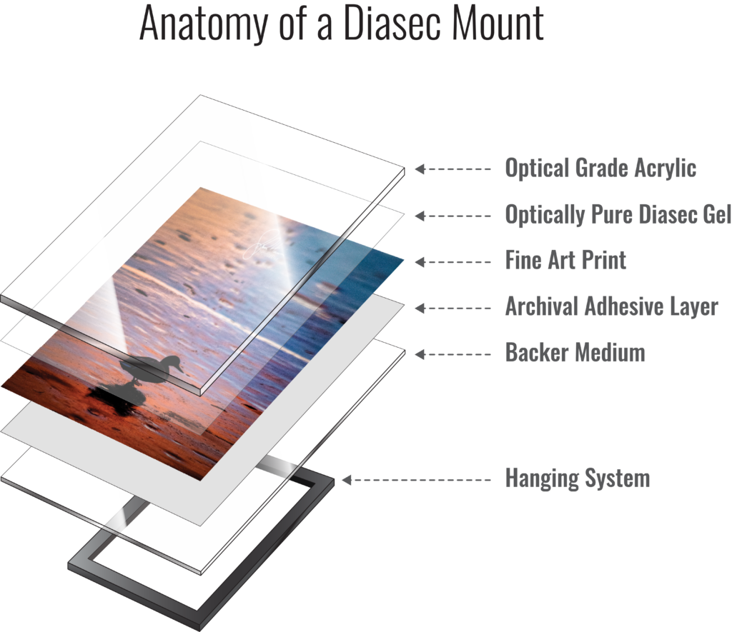
Diasec is a presentation AND a preservation process.

A very specific silicon gel, in combination with Diasec’s proprietary catalyst, results in a permanent bond that is superior to the pressure-sensitive adhesive technology that you might be familiar with. This bond is so effective, that it preserves your artwork by sealing out damaging elements — even in extreme environments.

It Has Real History

Face-mounting was patented approximately 50 years ago in Switzerland by Heinz Sovilla-Brulhart, who held the patents on several forms of print-to-acrylic bonding methods. He started out using varnishes and film-based adhesives before improving the system by developing a catalyst-activated silicon gel. When his patents expired, the simpler and less expensive processes that Sovilla-Brulhart had already discarded were adopted by the rest of the industry worldwide, leaving only a few producers of the silicone/catalyst process. To this day, it remains a closely guarded secret available only to licensed companies.

A few copycat processes have come along, but without the special catalyst, they lack the half-century track record of consistency and excellence that define the genuine Diasec product.  While a silicon gel alone will temporarily bond, it will also readily peel away. Only with the catalyst is the bond to acrylic permanent.

Go Deeper for the Difference

On the surface, Diasec is a high-end face-mount. Go deeper and the differences add substantial value:

The Diasec gel provides UV filtering greater than 99%, when used with even the most basic of acrylics. Acrylics suitable for fine art can provide additional protection nearing a total of 99.99%! When cured, the resulting permanent bond will not de-laminate, bubble, peel, or otherwise separate — even at temperatures high enough to damage the acrylic.

A typical shipping container or truck can reach summertime temperatures in excess of 130°f.  At those temps, pressure sensitive optical adhesives (PSAs) begin to soften, and when combined with shaking and vibrations during transportation, can fail. The last thing you want is for your buyer to excitedly open their expensive print only to find that the adhesive has separated.

As the first Diasec producer in North America, Reed is committed to ending this problem.

The Diasec process protects you and your art and, in turn, protects your reputation with collectors and galleries.

Pigment Papers You Ask?

Pigment papers, with the occasional exception, are quite compatible with the Diasec process and look amazing!

The wider gamut and significantly longer expected display lifespans of a proper Pigment Giclée print are a huge selling point for your collectors. Chromogenic papers often advertise a moderately good rating of around 70 years (estimated) under proper conditions. With the right combination of inks and papers, a pigment print may reach over 200 years (estimated) under proper conditions.  We think it’s pretty clear which option your buyer will prefer.

And the textures!

We were stunned by the beauty of fine art-textured papers within a Diasec mount. This dimension can be the visual turning point when it comes to convincing your clients to make the jump to this process. The print actually looks as if it’s “floating in acrylic” — an effect that must be seen to believe!

A Lifetime of Protection

Your image and the acrylic effectively become “one”.

Your work is sealed from 99%+ of harmful UV light and the humidity that can accelerate aging. Air borne pollutants that yellow and stain, and cleaning vapors that can prematurely fade the print are a thing of the past. The sealed print is also protected from the threat of mold, mildew, bugs, and other nasties that never rest.

And finally, a proper backer behind the print protects it from careless impacts to the verso once it’s in the hands of your collector or gallery.

  • The preferred face-mount system of major art museums.
  • Protection from over 99% of harmful UV.
  • Sealed from humidity, pollution and other contaminants.
  • Texture pigment papers are now possible for longevity and a unique look.
  • Not prone to the typical failures of pressure sensitive optical films.
  • Looks amazing, lasts a lifetime, and keeps your collectors happy.

High end galleries and world class museums demand the very best in facemount-to-acrylic protection and presentation. Reed is proud to be the first licensed dealer in North America to offer Diasec’s state of the art technology in this very specialized field.

We Have Moved!

For the last four decades, Reed Art & Imaging has owned and occupied the building at 888 Federal Blvd., in Denver, Colorado. That is about to change for us.

Due to a roadway widening project, by the City and County of Denver, we will be losing our entire customer parking lot.

“Staying was simply not an option. Our customers often need to pick up large and extremely valuable prints. Without on-site parking , and little street

Soon to be our new location at 8000 West Colfax Ave., Lakewood Colorado.

parking available, there was no way we could accommodate them safely and conveniently,” said Owner Bob Reed, who in 1976 founded Reed in the basement of his Lakewood home with wife and business partner, Betty Reed. “Our goal now is to turn this challenge into an opportunity that will better serve our customers and increase our contribution to the local art communities.”

With this in mind, we are excited to introduce our soon-to-be location in the heart of the fast-growing 40 West Arts District in Lakewood, Colorado. Given their own Lakewood beginnings and love for the arts, Bob, Betty and the rest of the Reed family feels like the move is a coming home of sorts.

Board Chairman and Executive Director of the Lakewood West Colfax Business Improvement District, Bill Marino feels likewise: “We are thrilled to have Reed join one of the state’s fastest growing arts districts and help us continue our mission of revitalizing West Colfax.”

Added one of Reed’s managers, John Harris: “We are eager to start a new chapter in a city that fully supports the creative arts, and in an art district that is rapidly growing its ranks. The historic building was once the Lakewood Movie Theater and we’re excited to bring visual creativity back to this building.”

40 West is one of the fastest growing art districts, and we will be proud to call it home.

At over 20,000-square feet, our new home will have room for a gallery area that will allow us to display work from our amazing family of clients, like renowned fine artists Kathy Beekman, Carrie Fell, Karmel Timmons, and photographers such as David Muench, John Fielder, and Jeff Mitchum. There are just too many to mention.

We also plan to use the parking lot along the front of historic Colfax Avenue for pop-up galleries or art markets, where artists can set up booths to sell their work. The new building will also be an ideal space for hosting fundraising events for arts and culture-focused non-profits.

To best serve our clients, we plan to stay open at the 888 Federal location throughout the transition to our new home, less than five miles

We are working closely with the City of Lakewood to preserve the historic signage on the building.

and just a few minutes away. Minor renovations are being made to the new site and we’re currently working with the City of Lakewood to keep the building’s important historic signage intact.

Through the many chapters of Reed’s history, we’ve seen a great deal of change, but we have always been a team of artists and creatives who have striven to bring success to our client’s endeavors. As ‘Artists Working for Artists‘, that will never change.

As we near our move, we will announce our grand opening event. Stay tuned!

Family-owned and operated Reed Art & Imaging is a nationally recognized fine art printmaker based in Lakewood, Colorado. Established in 1976 to create elite-level photographic and fine art prints, the company is dedicated to helping professional artists grow successful careers by providing the finest quality editions and reproductions. To better realize this goal, Reed has developed the “TrueArt Process,” a methodology focused on maximizing the creative equity that artists of all skill levels invest in their work. Reed also provides mounting and lamination services, large format pigment, metal and photographic prints, graphic design services and final installation.

Reed Art & Imaging Announces Move to Lakewood’s 40 West Arts District

NEWS RELEASE
June 13, 2017
For more information contact:
Lu Stasko, The Stasko Agency
303/477-9902 (Office)
720/404-4507 (Mobile)

For Immediate Release

Reed Art & Imaging Announces Move to Lakewood’s 40 West Arts District

— Long-running printmaker has acquired a new home on West Colfax Avenue —

DENVER, CO – Reed Art & Imaging, one of Denver’s oldest fine art printmakers, has purchased a new home in Lakewood’s 40 West Arts District. The company will move later this summer into an historic former movie theater at 8000 West Colfax, which currently houses a Harley-Davidson dealership. The move will provide Reed with more space and the ability to better showcase the work of their extensive client base.

Reed has operated out of its current location at 888 Federal Blvd. since 1979, but changes caused by the City of Denver’s Federal Boulevard Improvement Project, prompted the move. The project, which will add a third northbound lane between 5th Avenue and 14th Avenue on Federal and widen both the northbound and southbound lanes in that corridor, will eliminate Reed’s front parking lot, leaving it with insufficient parking for its customers and more than 30 employees.

“Staying was simply not an option. Our customers often need to pick up extremely valuable large format prints, so without on-site parking and with little street parking available, there was no way we could accommodate them safely and conveniently,” said Reed Owner Bob Reed, who founded the company in 1976 with his wife and business partner, Betty Reed. “Our goal now is to turn this challenge into an opportunity to better serve our customers and increase Reed’s contributions to the local art communities.”

At over 20,000-square feet, Reed’s new home has room for a gallery to display client artwork, some of which include such renowned artists and photographers as Karmel Timmons, John Fielder and Jeff Mitchum. Reed also plans to use its new parking lot along Colfax Avenue for pop-up galleries or art markets, where artists can set up booths to sell their work. Using the new building to host fundraising events for arts and cultural-focused non-profits is also a possibility.

“We are thrilled to have Reed join one of the state’s fastest growing arts district and help us continue our mission of revitalizing West Colfax,” said Bill Marino, Board Chairman and Executive Director of the Lakewood West Colfax Business Improvement District.

Reed plans to stay open throughout the transition to its new home, which is less than five miles from its current location. The company will be making minor renovations to the new site and is currently working with the City of Lakewood to keep the building’s historic signage intact.

“Many of Reed’s employees are artists and are passionate about pursuing their craft, so moving to an area that is focused on advancing artists and creative entrepreneurs feels like coming home,” added Bob Reed.

Family-owned and operated Reed Art & Imaging is a nationally recognized fine art printmaker based in Lakewood, Colorado. Established in 1976 to create elite-level photographic and fine art prints, the company is dedicated to helping professional artists grow successful careers by providing the finest quality art editions and reproductions. To better realize this goal, Reed has developed the “TrueArt Process,” a methodology focused on maximizing the creative equity that artists of all skill levels invest in their work. Reed also provides mounting and lamination services, large format pigment, metal and photographic prints, graphic design services and installation.

For more information visit www.reedphoto.com/moving

###

Reed Celebrates 40 Years

anniv40th-fbbanner

We’ve seen great change in the decades since we opened our doors.

Some creative mediums have shifted away from slower technologies into faster methods that allow artists to move faster into distribution of their editions.  Forty years ago, the internet was used exclusively by educational and government institutions and the idea and personal computing was limited to geeks and hobbyists.   Every print we made was exposed in total darkness and editions required very long hours (and sometimes days) of repetitive burning and dodging.

Modern technology has simplified some aspects of printing but some things haven’t changed at Reed.

Today, because your hard-earned reputation hangs in the balance,  every print is still hand-inspected for quality assurance and carefully hand-packaged prior to shipping to you or your buyers.  We continue to package as eco-friendly as we can because the planet we share deserves our respect. You wont’ find excess inks, plastics, or manufacturing in our packaging – just for the sake of making it prettier. We strive to eliminate excess material waste from the beginning of your job through delivery to your door. And we source from recycled and reclaimed materials when it’s appropriate.

Holding on to the old-ways is a good thing.

We think that old-school craftsmanship still has a place in the world of fine-art editions – that technology should be seen as a tool and not a primary focus in doing business.  While many vendors in our industry push further into electronic automation, we continue to keep the human element of craftsmanship in the areas where it matters most.  And like the old-days, you’ll find we welcome open conversations between you the artist and those who make your prints, because your artistic vision is more important to us than putting up barriers. Yes we actually see you as important – not as an inconvenience.  Some values are worth holding onto.

Thank you for everything you have done to help our continued success in this industry!

Sincerely,

  The staff and family at Reed Art & Imaging.

Art Lenses and the Photographic Print – are you wasting money?

Lightjet versus Lambda – are you wasting the money you spent on expensive art lenses?

Large format printing and why the LightJet is superior: It’s in the details – literally, The construction of the Lightjet is superior to the Lambda due to the ways that each device projects it’s laser light onto the photographic paper.

The LightJet loads it’s chromogenic print paper into a perfectly round, precision engineered drum with the laser beam that travels dead center along the axis of the drum’s circle.  This means the laser always strikes perfectly LightJetLamdaLaserCompare
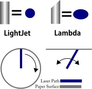
perpendicular to the paper, a perfectly round laser dot across the entire image area. The result is maximum sharpness and detail across the entire print – corner to corner, edge to edge.

Unfortunately the Lamda uses a stationary laser that swings in an arc as the paper moves along a track. This causes the laser to be “bologna cut” as it moves away from the center of the print towards the edges – creating longer and longer oval pattern. So the only perfectly sharp area of this print is precisely down the middle. As the laser moves towards the edges, the print increasingly suffers detail and sharpness loss. While this design allows for extremely long prints over ten feet, the loss of quality is substantial and noticeable.  Such print lengths provide productivity benefits to the company making the print, but not to the fine artist customer looking for the finest print available.

“For photographers who have invested in expensive art lenses to get edge to edge sharpness and enhanced IQ, it’s clear that the flat-transport technology is taking away the benefits you paid a bundle to get.” ~ John Harris: 30 year industry veteran.

We are a nationally recognized leader in fine-art grade large format archival printing for the professional Creative. We price competitively whether you need one print or a full edition, and our TrueArt™ Process guarantees your satisfaction.

Learn more about our chromogenic print options. 

The Difference Between Pigment Prints and LightJet Digital C-Prints

Q: What is the difference between lightjet digital c-print and Giclee? Which is better quality? Thanks! ~ A. A.

LightJet uses laser light to expose chromogenic photographic paper, which is then chemically developed and fully cleansed to create the archival dyes that render the fine-art image.

Giclee printing uses electrical impulses to deposit archival pigments onto fine art substrates such as canvas or watercolor papers, similar in the way a home ink-jet sprays inks.

As for your question about which has better quality: Though you will find fans on both sides of the fence, neither is really lesser to the other for “quality” but they each have their differences that can be appreciated. Fine art photographers tend to prefer the LightJet Digital C-Print because the photographic print has a certain look and feel that works very well with the art-form and the color tends to be less artificially saturated and thus feels natural. Giclee Pigment Prints are often favored by fine artists due to the substrate selections of watercolor paper or canvas being closer to that of their original artwork. They both posses extremely high sharpness and wonderful color, contrast and detail. The Lightjet is continuous-tone and does not use dots, allowing for smoother tones and detail in highlights with richer saturation in the shadows. The Giclee Pigments allow for more mid-tone color saturation, especially in the yellows and magentas.

Lightjet and Giclee Pigment are both for reproduction of fine art, and exceed the quality of consumer level printing by significant margins. When combined with professional archival fine art substrates and the skills of a master printer the result is a genuine fine art print. Both prints are museum quality and as such, certificates of authenticity may be used with integrity.

Our LightJet and Giclee Pigment prints have been hung in fine art museums and the Smithsonian, so rest assured you are getting the “real deal’ in a fine art grade print regardless of your choice.

Picking the right colorspace based on image content

An often overlooked aspect of color-spaces is the ability to use them to affect the overall “look” of the image. This 3D model represents 4 color spaces:

Pro RGB (in red), Adobe1998 (translucent white), sRGB (white wire-frame) and in yellow; a professional giclee printer – the Epson 9900 on Ultra Smooth Fine Art Paper.

GamutSaturationLimits

Top view of these gamuts shows their maximum saturation limits. The yellow wire-frame in the center is the available gamut of Epson’s 9900 Inkjet Printer.

The top view shows the saturation boundaries of the colorspaces. The larger the space appears here, the more saturation the color space will support.


Gamut brightness limits of ProPhotoRGB, Adobe1998, sRGB and the Epson 9900

Gamut brightness limits of ProPhotoRGB, Adobe1998, sRGB and the Epson 9900


The side view shows the brightness levels available in the various color spaces. White is represented at the top and black at the bottom.


Color-spaces with larger hulls allow for greater saturation limits. This means a red with an RGB build of 255, 120, 120 will appear more saturated in ProPhotoRGB than it does in Adobe 1998.  Neutral colors will appear identical for hue across the color spaces, though the density (brightness) of those neutrals may differ.

How this affects the look of the image is quite dramatic. A side effect of saturation limits is it’s affect on the visual difference between two neighboring color values.  The examples below are screen grabs of the same color build across the three most popular working color-spaces. The left side of the boxes are a build of 255R 255G 126B, and the right sides are 255R 255G 112B

The color variation is barely perceptible in sRGB, but noticeable in the slightly larger Adobe1998 and more so in the much larger ProPhotoRGB. You can also see that as the size of the colorspace increased, the saturation increased.

Images with subtle variations in tone may be adversely affected from the use of a larger colorspace such as ProPhotoRGB, however if an increased separation is what you are looking for, tagging your file as ProPhotoRGB may benefit.

These samples, like the ones above contained all identical Photoshop builds, but were assigned different spaces. As the size of the color space increased you can see that the color separation also increases resulting in a loss of subtlety.  This loss means in increase of color noise, and in 8 bit files: a potential for banding. Real 16 bit files (not files converted from 8bit to 16) have a small likelihood of banding as long as they remain in 16bit. However, large portion of professional printing devices will eventually convert your 16bit file to 8bit for printing, and this could result in banding issues. Regardless of bit-depth, saturation will be higher in the larger spaces, so it’s something to be aware of and use to your advantage when needed.

This image is in the sRGB color-space. Notice the presence of subtle tones

The variations in tones in this image are pleasant yet still fairly subtle.

The variations in tones in this Adobe1998 image are pleasant yet still fairly subtle.

The subtleties in the lilly pad are nearly lost. A visible increase in color noise is also present in the water.

The subtleties in the lilly pad are nearly lost. A visible increase in color noise is also present in the water.

You will notice in the examples that as file is moved into spaces of increasing size, subtleties in the colors can be lost.  You can see larger views by clicking on the sample images.

As saturation increases, the the visible difference between neighboring colors increases. One artifact of this is an increase in color noise. This becomes quite apparent when comparing the reflections between the sRGB and the ProPhotoRGB files.   Also worth noting is how the “sky” colors in the reflection actually lose saturation with the larger ProPhotoRGB space. This is due to Adobe1998 and sRGB having greater saturation in a significant range of values in this region of color. So if sky saturation is of critical importance in your print, do a bit of testing before you commit to ProPhotoRGB and compensate when possible. Sometimes we get to accept some benefits at the expense of others, and working color-spaces are no exception.

sRGBLillyPadsToPrintSpace

sRGB color-space file converted to the Epson 9900 print space using perceptual intent.

Adobe1998RGBLillyPadsToPrintSpace

Adobe 1998 RGB color-space file converted to the Epson 9900 print space using perceptual intent.

ProPhotoRGBLillyPadsToPrintSpace

ProPhotoRGB color-space file converted to the Epson 9900 print space using perceptual intent.

So use your colorspace selection as a tool to further optimize your print results. Be conscious that you aren’t losing or gaining numbers of colors by using a different space, you are merely matching image type to saturation limits and distance between colors. And as always, should you have any questions, reach out in the comment section below!

How Colors are Created in the Digital World

This short basics post will prime you to understand how colors are specified in digital files. In the reproduction market, of which Reed Art & Imaging is a part of, we use digitally driven devices to make faithful reproductions of original art, photographic captures and digital graphic designs. To accomplish this task with any hopes of repeatable accuracy, there must exist a standard system by which colors can be recorded, transferred, translated and output. These standards exist in theoretical color models. These models are a virtual shape, such as a box, sphere. polygon or other shape that if it were real, would contain every color visible to the human eye.

By SharkD (Own work) [GFDL (http://www.gnu.org/copyleft/fdl.html) or CC-BY-SA-3.0-2.5-2.0-1.0 (http://creativecommons.org/licenses/by-sa/3.0)], via Wikimedia Commons

The RGB color model mapped to a cube. The horizontal x-axis as red values increasing to the left, y-axis as blue increasing to the lower right and the vertical z-axis as green increasing towards the top. The origin, black, is the vertex hidden from view.

Because the model is represented by a shape, they are referred to color “spaces”, for the space the object would occupy in the theoretical environment of all colors – visible and invisible. The graphic above is an example of a space that uses Red, Green, and Blue to yield the final color we want to create.

Colors come to our eyes in two ways – or transmitted from a light source or reflected off of a surface.

RGB is called the “primary” space and it’s numerical system can be equated to the brightness values of transmitted light – or how intense the Red light, Green light, and Blue light are shining. As the numeric value increases, the lights get brighter and the closer to white they become. More on that in a bit.

In a CMYK model (the secondary space) we are representing pigments that absorb light. So as the number increases in their scale, the more light is absorbed. So with CMYK, the higher the number, the darker the color appears – exactly opposite of RGB.

In either space, the ratio of how the colors are blended determines the color, while numeric values contribute to how bright or dark it is.

For simplicity, the rest of this article will use only one color model. I’ll use the RGB model for these examples because it’s the model that our clients use and best supports high-end reproduction digital printing.

How Color is Expressed

Color is usually expressed in human terms by it’s

  • Value (light to dark)
  • Saturation (how close to pure is it)
  • Hue (red, purple, green, yellow, orange, etc.)

In the data driven world, it’s expressed as a recipe of the colors required to build its final value, saturation and hue. Image and graphics applications usually use the standard scale of 0-255 ( what is called 8-bit color) to represent the amount of each color present, with 0 being none and 255 being maximum. Dark colors being closer to 0 and light colors being closer to 255. Equal amounts of each color create neutral hues ( grays ) and as the numbers increase from 0 to 255 the value moves from black to white.

Darker values are closer to zero and lighter values are closer to 255

Darker values are closer to zero and lighter values are closer to 255


These numbers from 0 to 255 are called “Levels” and in our examples fall into a model of 256 levels – with zero being included as a level.  In an RGB color space, each color is built using various levels, or recipes, of Red, Green and Blue.  Dark Red has a different recipe than Light Red, and the recipes are different for a saturated versus less saturated red.

Fully saturated red is a different build than a less saturated red.

Fully saturated red is a different build than a less saturated red.

Dark Red has a different build than Light Red.

Dark Red has a different build than Light Red.


As you can see in the first example above, a fully saturated hue has 255 of it’s requisite colors and none of the other colors. As the color desaturates, it gains some of the other colors; it’s moving closer to a neutral gray.  In the second example we can see that the Darker Red contains none of the other colors, but the Red number is dropping closer to zero; thus making it “blacker.” This darker red is as saturated as it can get at this present value.

A critical point to understand is that in an RGB or CMYK file, color and density are inter-connected. Meaning that any change you make to color data will result in changes to density and visa-versa.


The other primary colors are built in the same way, like this:

Color builds of fully saturated Red, Green and Blue.

Color builds of fully saturated Red, Green and Blue.


The secondary colors are built from equal amounts of two of the three colors:

Graphical representation of the secondary color recipes

Secondary colors are built from two of the three colors

These secondary colors are thought to be the “opposite” colors to those in the previous example. You will notice their recipes are directly inverse. Red is R255 G0 B0 and Cyan is R0 G255 B255.  They are opposites because when the two colors are combined, they cancel each other out and make gray.  Equal parts of Red and Cyan make gray, same goes for Green with Magenta, and Blue with Yellow.

Intermediate colors such as Orange, Brown, Purple, Daisy Yellow, Lemon Yellow etc. are built by using various values of the three colors where at least one of the colors is greater than 0 and less than 255:

Intermediate color builds

Intermediate colors result from builds using two or more colors.


This 8-bit model, using it’s 256 level per color channel architecture allows for approx 16.7 million variants of color and density.  (256 x 256 x 256 = 16,777,216).

Other bit-depths exist that extend the number of available colors; the concepts are the same, but the numbers differ.

For example: 12-bit color – the depth that most digital cameras record in raw format, has 1,728 levels per color channel (instead of 256) with a total number of 5,159,780,352 available colors, much higher than present technology can reproduce in a print or display.  The commonly used 16-bit depth has 4,096 levels per color channel with a total number of 68,719,476,736 available colors – yes that’s 68.7 Billion!  While some professional pigment printers and their RIPs can support a 16-bit file, getting the subtleties from that many colors on paper and dots via a limiting 8 to 12 different ink colors is still problematic.

If you have questions, post them in the comments below.  If you want to see how this all ties together with Photoshop channels, stay tuned, that’s next!


Photoshop Channels De-mystified

Color channels are often thought to be the exclusive realm of mystics and Photoshop gurus. If you are willing to dedicate a few minutes of time to learning, I’ll take the mystery out of channels, and give you the power to improve your workflow and your end results.

The colors we see on our monitors and in print are created by combining specific amounts of either Red, Green, and Blue, or Cyan, Magenta, Yellow, and Black with the result being a new intermediate color.  Since the majority of our readers are using the RGB model, I’ll stick with that for our examples. If I get requests in the comments below, I’ll add a section explaining CMYK.

Most users of image editing applications like Photoshop or Gimp, as well as users of other graphic design applications are familiar with, or have heard mention of the 256 levels used to define color and density.  Most often these levels are represented by numeric values from 0 to 255 with zero being one of the levels.  In the RGB model, these levels can be equated with visual light, zero being no light, or pure black and 255 being maximum light – pure white.

The 256 levels represent visual density ranging from black through white.

The 256 levels represent visual density ranging from black through white.

When we build colors in the 8-bit RGB model, we are using 256 levels of Red, Green, and Blue in various combinations called a “build”. You can think of the color-build as a recipe for that specific color.

Intermediate colors result from builds using two or more colors.

Intermediate colors result from builds using two or more colors.

Collectively the color channels are nothing more than a representation of those recipes. And when the recipes for all the pixels are put together in the right order, we have our color image. Viewing our color channels is effectively changing the way your cook-book is organized. So rather than finding the recipe for the pixels on one page of your cook-book, your color cook-book has three pages, one each for Red, Green, and Blue. The Red page tells you how much red to use and where, the same goes for the Green page and the Blue page.  So in our example above if we assume that each colored square represents 1 pixel, the Red page would tell us the first pixel would have 255 red, the second pixel would have 68 red and the third pixel has 126 red. The Green page would read: 1=128 and 2=68 and 3=0 and so on for the Blue page.

Photoshop shows us these channels in a way that our minds can easily process: as images. We can grasp the concept of images much easier than looking at the potentially millions to billions of numbers required for single image. Photoshop’s default is to show you these images as various shades of gray (256 possible shades to be exact). Here is what our example above looks like as color channels:

Red Channel

Red Channel

Green Channel

Green Channel

Blue Channel

Blue Channel


Where the build calls for zero of a color, that channel represents the area as black. Where it calls for all of that color, it is represented in the channel view as white. All intermediate values show up as the appropriate shade of gray.


Real World Examples

This image is pretty much straight out of a raw conversion. The file has been optimized in the conversion to make sure that none of the channels contain either pure black or pure white. This is to mimic the way the eye naturally sees. We’ll compensate for its somewhat flat appearance when we show you how to optimize your files without damaging your color fidelity.

copyright John G Harris

Full color view. This is called the “composite” view.

Here is the view of the red channel, remember lighter areas indicate more red, darker indicates less:

copyright John G Harris

Red channel contents.

Here are the Green and Blue channels, you can click them for larger viewing:

Copyright John G Harris

Green channel contents.

Copyright John G Harris

Blue channel contents.


Notice that the lighter areas of the scene show as lighter in all three channels, and the darker areas of the image are darker in all three channels. You can also see that the areas of the image that are green show as brighter in the green channel in relation to the other two.

Also, all three channels have complete detail from shadows to highlights, nothing is lost. This is critical for full color fidelity. This full range of detail is essentially how channels should be. When channels look muddy or if there is “clipping” to full black or full white, there is a loss of color fidelity. I use channel views regularly to examine the state of a file’s “health”. If the file’s channels are not right, then I know right away I can’t generate the best possible print.

It is key to understand that in an RGB color space, a channel is both color and density information. Any change that you do to a channel will affect the color, saturation and density of your file. If you increase any value in a color channel, let’s say moving the red value of an area from 180 to 185, the resulting color will be more red and lighter.

See, no mystics required.

Reach out in the comments below with questions and comments.

Easy and Inexpensive Tips for Better Video Meetings

BadVideoInMonitor

So there you are, trying to video conference with the a client, vendor, investor, or mom and your video feed, well…. stinks. Nothing makes a bad impression like a bad impression.  I recommend that you always test your video setup a couple hours before you need to go live, making sure your webcam is working and the picture looks good. And just in case you need to call your tech support team or fix it yourself. Here are some basic and straight-forward things you can do to make sure a working system performs well.


Keep it clean!

Lens cleaner and microfiber are your friend. Get a cleaning kit from your local optician and keep your web-cam clean. Spray solution on the microfiber NOT on the camera. Gently remove junk and dust. The lens on your webcam is super tiny, so even a small spec of dust, lint or hair can have a major impact on image quality. Finger prints are worse, and can make your video look like it was shot through plastic bags – yuck. Leave the soft focus effect to Glamour Shots.

Can they hear you over all that noise?

Use a separate mic and turn off sources of background noise. The built-in mic on your laptop will

Head-worn mics sound much better than built-in computer mics and aren't as noise prone as a lavalier.

Head-worn mics sound much better than built-in computer mics and aren’t as noise prone as a lavalier.

likely pick up a great deal of background noise including the sound of your voice echoing off your walls. An inexpensive lavalier (Lapel clip style) mic can be plugged directly into the mic input of your computer. USB podcast mics can be reasonably priced if you don’t need portability. Head-worn mics are super the best of both worlds and unlike the lavalier, they won’t pick up the sound of your clothing as you move about.

When possible, use ear-buds instead of computer speakers. The sound from your speakers will be picked up by your mic and can lead to echos , feedback, or muddiness in your audio. Cheap ones can be purchased at the dollar stores but they’re not so good on your ear health. Be good to your hearing and invest in the best you can afford.

You can also get a head-set that has both head-phones and a boom mic. These are available from bulky down to slim and lightweight. Go light-weight if you’re not into that 80’s air-traffic-controller look.

A combo headset like this is portable, sounds great and can eliminate back-gound noise and echos

A combo headset like this is portable, sounds great and can eliminate back-gound noise and echos


Heloooo? Is anybody there? It’s important to use sufficient lighting.

CFL’s run cooler than halogen and incandescent.In low-light conditions, your camera has to amplify the signal it sees and this results in noise that looks like graininess, ugly color and lack of sharp focus. This get’s worse with lesser quality webcams. The light coming from your monitor should not be considered sufficient.  A minimum of two 60-watt equivalent lamps within 6 feet of your face is a good starting point. A couple of cheap Harbor Freight or hardware-store clamp-on work-lights – one pointed directly at you and one bouncing light off the ceiling can create a soft and pleasing look. Use compact fluorescent bulbs since they run cool and won’t heat up your office.

Avoid back-lighting else you look like a talking silhouette with glowing edges. This type of lighting can also create havoc with the auto-exposure systems in your camera that can result in a visual pulsing that will serve quite well to annoy your viewers.

Inexpensive and available from tool and hardware stores. The larger the reflector, the softer the light. Get better light by using two or more.

The bigger the reflector the softer the light. A 10.5″ dish is better than a 6″ dish. You can also paint the interior white to soften the light a bit more. This will help reduce pore detail and the visibility of wrinkles too! Not that any of us are actually concerned about such things…


Yeah okay but those work-lights look terrible in my carefully designed office. What then?
Ikea has some great looking work lights in both clamp, table and floor options.

Certainly a step-up from the look of a shop light. Would also make a great background light.


Nicely styled clamp light. Moves easy and clamps about anywhere. Larger reflector provides a decent light. Point one at you and bounce the light of the other off an opposite wall for great looking light.


Part of the same Ranarp series, this could easily be combined with a couple of clamp-ons to create some fantastic light for your video sessions.


China Ball style lantern from Ikea for wrap-around soft light

China Ball style lantern from Ikea for wrap-around soft light

In the professional video world there exists a type of light called the “China Ball”. Inspired by the round paper lanterns of China, these cast a omni-directional light that is super soft, very flattering and somewhat mimic the look of a professional soft-box except they throw the light everywhere – not in just one direction. The lighting is not inspiring from an artistic cinemagraphic point of view, but the lights look nice in the home or office. The lanterns are intended to be hung from the ceiling pendant-style and can be found at Ikea and import stores for around $5. https://www.ikea.com/us/en/catalog/products/70103410/ These are just the lanterns. You will also need a light kit that includes socket, cord and built-in switch. https://www.ikea.com/us/en/catalog/products/70103410/

Ikea has many stylish lighting options that mimic the china ball for under $20
Floor: https://www.ikea.com/us/en/catalog/categories/departments/living_room/10731/?priceFilter=true&minprice=7&maxprice=20
This model allows for both bounce and direct lighting in one. It is a torchiere with a side light mounted on a gooseneck that can be pointed where you like.
Table:
https://www.ikea.com/us/en/catalog/products/70096377/
and
https://www.ikea.com/us/en/catalog/products/40172462/


Quality video streaming also requires a good network, fast internet and a computer that isn’t running at a crawl. For more tips on improving your video chats, check out the post: Improving Your Google Hangout Experience.

Do you have some tips you would like to share? You can show your stuff and help others by adding your ideas to the comment stream below.