Are you on trend with metal prints?

You’ve heard about them, you’ve seen a few, but you’re still wondering what it’s all about.

Metal prints are exploding on the art scene and consumers are loving it!  Images printed on aluminum are modern, stylish and impactful and add a higher perceived value than flat prints.

So what’s the deal with metal prints?

I want to help you understand the differences in your choices.

The home version of metal prints

The craft version of metal prints is done with an ink jet printer.  Ink is printed on either a transfer paper or on an aluminum sheet.  (Not to be confused with metallic ink jet papers.)  The paper sheets are adhered to aluminum (or other materials) with heat.  The aluminum sheets are specially prepared to receive the ink.  The aluminum sheets are fragile being only from .005” up to .025” thick and should be mounted to another material to create a rigid piece.  This method compatible with most ink jet printers and while inexpensive is prone to fading.  This is a great option for craft projects.  There are strict size limitations based on the printer’s abilities and limited purchase options.

Dye Sublimation or Infused Metal Prints

This technology starts when a high-resolution full-color mirror image is printed on specialized transfer paper – sometimes called a carrier sheet.  This carrier is then is carefully aligned and heat infused with a specially coated aluminum sheet.  Through heat and pressure the inks are vaporized and drawn into the coating on the metal. When the transfer process is completed, the metal print is allowed to cool and the dyes are now locked into the coating.

The coating is applied in different surface textures and a choice of opaque white, or clear that allows the metal to show through. Currently Reed provides you with four choices of finished surfaces: white matte and white gloss as well as clear matte, and clear gloss. The white metal print options are the most popular as they look like most like a normal photograph.  Clear allows the metal to show through in the highlights for a distinct and eye catching effect.

The metal print coatings are quite durable, resistant to moisture and abrasion, making them an excellent choice for humid or high traffic areas. They are also more fade-resistant than ink jet prints and can be easily cleaned with non-ammonia glass cleaner. They can be used outside but should be kept out of direct sun light.

Dye sublimation by many accounts is considered an improvement over traditional ink-jet printing as it has higher saturation and contrast with a much richer black, and no visible dots.

This is a great print for the artist looking for quality, speed and affordability. Approximately 1/16”;  we have sizes available up to 48”x96”.

Finally, the metal product with the highest sharpness is called a Contemporary Metal Print.

This is a photographic print created by exposing latent image photo-sensitive polyester media to laser light, and then developing in a photo chemical bath. The print is archivally mounted to a rigid 1/8” thick aluminum plate using cold press adhesive and an amazing and eye grabbing glossy laminate that improves contrast, apparent sharpness and color that looks very high-end.

Because the media is polyester and not paper it is not prone to peeling like large paper prints can. Being a photographic process using lasers, there are no visible dots in the final print.

With the high level or sharpness and amazing visual depth, the contemporary is the ideal option for artists and their buyers with discriminating tastes.  Rigid 1/8″ thick aluminum available in dimensions up to 48″x96″

If you have further questions the group of talented artists at Reed will be glad to assist you.  We know how to collaborate with you and see your visions become reality.
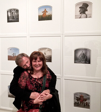
The Difference Between Pigment Prints and LightJet Digital C-Prints

Q: What is the difference between lightjet digital c-print and Giclee? Which is better quality? Thanks! ~ A. A.

LightJet uses laser light to expose chromogenic photographic paper, which is then chemically developed and fully cleansed to create the archival dyes that render the fine-art image.

Giclee printing uses electrical impulses to deposit archival pigments onto fine art substrates such as canvas or watercolor papers, similar in the way a home ink-jet sprays inks.

As for your question about which has better quality: Though you will find fans on both sides of the fence, neither is really lesser to the other for “quality” but they each have their differences that can be appreciated. Fine art photographers tend to prefer the LightJet Digital C-Print because the photographic print has a certain look and feel that works very well with the art-form and the color tends to be less artificially saturated and thus feels natural. Giclee Pigment Prints are often favored by fine artists due to the substrate selections of watercolor paper or canvas being closer to that of their original artwork. They both posses extremely high sharpness and wonderful color, contrast and detail. The Lightjet is continuous-tone and does not use dots, allowing for smoother tones and detail in highlights with richer saturation in the shadows. The Giclee Pigments allow for more mid-tone color saturation, especially in the yellows and magentas.

Lightjet and Giclee Pigment are both for reproduction of fine art, and exceed the quality of consumer level printing by significant margins. When combined with professional archival fine art substrates and the skills of a master printer the result is a genuine fine art print. Both prints are museum quality and as such, certificates of authenticity may be used with integrity.

Our LightJet and Giclee Pigment prints have been hung in fine art museums and the Smithsonian, so rest assured you are getting the “real deal’ in a fine art grade print regardless of your choice.

Under Review

[On the Reed Magnet Wall] are just some of the gallery cards that Gary Reed & Barb Pullin acquired over the course of their visits — plus their well-used schedule of events

On the Reed Magnet Wall are just some of the gallery cards that Gary Reed & Barb Pullin acquired over the course of their visits — plus their well-used schedule of events


The Month of Photography 2015 was a roaring success! This year’s MoP ran from mid February to the end of May with one show going all the way to July. Gary and I put together a weekly list of openings that we planned on attending, and invited friends to join us. We were out every week from Wednesday to Saturday and hit a grand total of 72 openings — it was exhilarating!

The MoP organizers really had their stuff together on the www.mopdenver.com website. The photography and information of each Gallery, Coffee House and Sponsor was effective, colorful and clear; a helpful feature that made it super-easy to find out each day what and where events would be happening.

After a few times out, we discovered a consistent theme going on with the exhibits: White walls, white frames and white mats seemed to be the standard presentation. After several weeks everyone else was talking about it too. I have to admit, this style lent added visual punch by making the photographs stand out and not compete with their surroundings.

This event also brought the creative community together and gave everyone an opportunity to make new friends, see old ones and see to it that photography was the buzz around town!


There were so many fantastic photography exhibitions. Here – in no particular order – are the ones that left the strongest impression on us:


Donna Rae Altieri: 50 Years in Your Face / Ironton Studios and Gallery

In a word: “Fun”. Donna’s photography over the decades is just so entertaining and a joy to see.


Jason DeMarte: Confected / Rule Gallery

“Amazing and Beautiful” Congrats to Valerie and Rachael.


The Long Road: A Photographic Journey / The work and legacy of Hal Gould and Denver’s Camera Obscura Gallery Dona Laurita Gallery in Louisville

Being there at the opening and it also being Hal’s birthday made it a special day. It was like a taste of the old Camera Obscura days. Gallery owner Dona Laurita put together a fantastic exhibit.


Role Play – CPAC Group Show Exhibition / Redline Project Space Gallery

Well-presented and engaging. Great job Rupert Jenkins and Connor King.


Liz Hickok: Ground Waters / Michael Warren Contemporary Gallery

Liz’s work is so unique. We loved it and the mural at 34th and Downing was spectacular.


Mike McClung, Barb, Liz Hickok, Gary and Warren Campbell at the Groundwaters show

Mike McClung, Barb, Liz Hickok, Gary and Warren Campbell at the Ground Waters show


Analog / Mike Wright Gallery

Mike and Sarah hit a major home run with this blockbuster.


Carol Golemboski, Barb, Bill Adams, Marti Foxhoven and Gary at Mike Wright Gallery

Carol Golemboski, Barb, Bill Adams, Marti Foxhoven and Gary at the Mike Wright Gallery. Selfie by Gary Reed


Focus Spark / Gallery

A group show, this one curated by Mark Sink had wonderful style and variety and Reed’s own Marti Foxhoven sold one of her pieces!


Grays Space Gallery / Curated by Sarah LaVigne

Sarah always pulls together a great show and this one certainly did not disappoint — a fantastic way to kick off the MoP season.


Entre Nous: The Salon Romantique / Presents The Nude / Entre Nous Galerie

Elegant — to say the least.


Mark Sink, Rupert Jenkins, Barb and Gary outside at Entre Nous

Mark Sink, Rupert Jenkins, Barb and Gary outside at Entre Nous. Photo by Sam Nguyen


Not As It Seems & Vigorous Revelations / Valkarie Gallery

Two exhibits at Belmar that were well curated and worthy of a top MoP listing. We even bought two pieces! I’d like to put a shout out to Bob Jewett and his amazing show.


What Has Never Been… Is / Hinterland

When Sabin Aell puts a show together you know it’s gonna rock!


Travelers 5, It’s all in Black and White, Focal Points / Tbellphotographic Studio

The three shows for MoP at Tbell Gallery. The Travelers show curated by Sharon Meriash is always, always a fun and interesting exhibit. Reed’s Bob Jewett and Gary Reed were amongst the selected photographers. The Black and White show is also a MoP tradition that we would never miss, and the final show, Focal Points, was another wonderful collaboration of Terri Bell and Sharon Meriash. So good, we bought two pieces here also! And BTW, Jody Akers took Best of Show in the Black and White Show.


Gary and Barb at Travelers 5 Show

At the Travelers 5 Show. Photo by Mark Sink


The Origins of Photography, Past and Present / The Pattern Shop Studio

Wow, what a collection of vintage imagery. No wonder it ran for over two months.


Damak to Denver: A Picture Me Here Project / Curated by Brigid McAuliffe Denver Photo Art/John Fielders Colorado Gallery

Get to know their story and all you can say is “Amazing!”. Images that really make you think about how and where you grew up. Not only that but by far the best food!


The Dairy Center for the Arts, Boulder

There were three shows here at the same time and each was well displayed, well curated and totally fascinating.


Alternative Processes / Art Students League of Denver

Now how great was it that ASLD was showing photography! This was a small but very interesting exhibit.


Lift / St. Mark’s

OK, so the girls rocked it again with fantastic images of all shapes, sizes and styles.


Surface Film / Anthology Fine Art

Zach and Kendra’s annual photo show/ fundraiser for Trout Unlimited. This show gets stronger every year and this one had some very cool images.


Barb Gary at the Anthology Show

The Anthology Show. Selfie by Gary Reed


Far Between / Robischon Gallery

Well done, Jim. This exhibit was definitely in our top five.


Gary and Barb at Robischon Gallery

At the Robischon Gallery. Photo by Richard Alden Peterson


Kristen Hatgi: A Tented Sky / Gildar Gallery

Delicious!


Redline was once again the mothership of MoP and hosted ‘Playing with Beauty’.

This was another show curated by Mark Sink that was both big and beautiful. The opening night brought everyone together for a great time, great art and a chance to see and be seen with some of the incredible talent Denver has to offer.

It was an amazing journey and we’re sorry it’s over. Looking forward to 2017!


Staff Wheat-pasting for Month Of Photography 2015.


Every two years the highly energetic creatives here at Reed turn things up to 11 when Month Of Photography(MOP) comes around. This bi-annual event has gone global in its reach and this year was no exception. MOP 2015 has seen large-scale gallery participation in support of photography as an art form, and the outdoor attraction of wheat-pasting is exploding in popularity. We’ll have a several posts covering activities around this event, but this bit of fun is one of our own.  This is the second time that we have made the exterior of our building available for wheat-pasting artists during MOP. An art form traditionally using black and white images on inexpensive paper, this year our team decided to go bold with a splash of color. We had a great time hanging the work of our in-house artists with a special section reserved for winners of our social media competition. This show’s curation and direction was handled by our own Barb Pullin and Gary Reed.

The reviews for this show have been mixed. Traditionalists don’t care for the color – some quite adamantly against it, while those willing to step outside of tradition are looking to embrace it in their works for the next MOP.   Have a look and let us know your thoughts. Should wheat-pasting be black and white only, or do you appreciate the color?

Update: We’ve had five pieces stolen from this show – peeled right off the walls!


Happy Earth Day

earth_hear_041808

Happy Earth Day! Did you know that we offer and Eco Friendly Product? Well, we do. Let me take just a quick second to tell you about our Gallery Mount Collection and how you can be Earth friendly every day of the year, not just on Earth Day.

We use premium MDF with a Composite Panel Association (CPA) certification of 100% recycled/recovered fiber in compliance with their Environmentally Preferable Product (EPP) specification CPA 3-08. These products are also certified for Forest Stewardship Council (FSC) chain-of-custody and controlled wood recognition. Scientific Certification Systems (SCS) has awarded certification to our supplier for producing products using recovered and recycled materials. UltraStock Select, Premium and Lite MDF are certified to contain pre-consumer recycled fiber on a dry fiber weight basis of 75% and 80% depending on manufacturing facility.

WOW! What does all of that mean? It means that we are doing our best as a company to help our clients be as eco friendly as possible and still create beautiful finished photographic pieces of art to put out into the world. Art is beauty and beauty does not have to hurt (our planet). We also reuse and recycle our shipping materials and no longer use incandescent light blubs, something we can ALL do everyday of the year to keep our planet green! *Image provided by NASA

Behind the Scenes – Outdoor Installation for Month of Photography

It’s a busy street corner, and the building is vacant, but an eyesore it’s not. Now dressed in the fine art of Liz Hickok, the building is now sporting jewel like colors and makes a bold statement – all in honor of a show at Michael Warren Contemporary Gallery in Denver’s Santa Fe Art District.  Part of the bi-annual Month of Photography, this is just one of dozens creating a buzz. Liz Hickok’s amazing art joins pieces from all over the globe. Kick back and relax as Gary Reed and Jody Akers install this magnificent artwork.

Reed Art & Imaging, Richo, and John Fielder Sponsor Picture Me Here Event

PMH_MOP_Flyer_

FOR IMMEDIATE RELEASE

Event: “Damak to Denver: A Picture Me Here Project” Exhibit Features Bhutanese Refugee’s Photographs and Stories of their last days in a refugee camp, their journey to the United States and their first days in Colorado. Location: John Fielder’s Colorado & the Denver Photo Art Gallery, 833 Santa Fe Drive, Denver, CO 80204
Exhibit dates: March 6 – April 25, 2015 Opening reception: March 6, First Friday, 5-9pm Gallery Hours: Tuesday-Saturday from 9am-5pm, with extended hours on First Fridays Project Partners: United Nations Refugee Agency, International Organization for Migration, Caritas Nepal, Reed Art and Imaging, Ricoh/Pentax, Colorado Photographic Arts Center, Aurora Cultural Arts District, City Museum of Kathmandu, 258 Kickstarter Donors
Denver, CO (November 22, 2014) – Last Spring, Picture Me Here (PMH), a digital storytelling program for refugees based in Denver, provided cameras and training to Bhutanese youth living in a refugee camp in Eastern Nepal. The young refugees were scheduled to resettle in Aurora and most arrived by August. This training led by photographers and storytelling mentors empowered them to document their last days in the camp, their journey to Colorado and their first impressions of life in the US. Opening on March 6th, John Fielder’s Colorado & the Denver Photo Art Gallery will host an exhibit featuring a selection of these photographs by these individuals as they reflect on the past and start building new lives in America. Photographs and books will be available for purchase. Proceeds support the photographers, the PMH program and John Fielder’s Colorado & the Denver Photo Art Gallery.
PMH started in 2012 working with local refugees. The project in Nepal is their first international project and was made possible with help from the United Nations Refugee Agency. “PMH is committed to fostering communication, integration and connection among diverse groups of people. Participants document their lives and realize the value of their stories while learning new skills in leadership, technology and English” says Brigid McAuliffe, PMH director. Exhibit is open to the public and is free admission. More details about the exhibit can be found, when available, on www.denverphotoart.com
________
# # #
“Everything about the photo says Nepal, from the posters on the wall to the men. It reminds me of how much I love Nepal.” – Keshavi Neupane
“Dhaka weaving is very important and a big part of life in Nepal. The women are like a second mother to me and hold a very special place in my heart.”  – Keshavi Neupane
“This is a photograph of my neighbor. She is sieving rice to make food. Though she’s extremely old, she has the power to see the very small pebbles. This is something she does twice a day, both early in the morning and again in the evening. By seeing this photograph, I realize that every person is capable to do work.” -Bhim Bahadur Bhattarai
“This woman is my aunt. She is cooking curry with some tomatoes in the bowl beside her. The sunlight scatters from the slats in the wall of her refugee hut.” -Bhim Bahadur Bhattarai
“This is the photograph that I took Bhadrapur Airport in Nepal. At this time, I am ready to take a flight from Bhadrapur to Kathmandu, which is the capital city of Nepal. At this moment, I am feeling amazing because this is the first time I am taking the airplane. I am excited.” -Bhim Bahadur Bhattarai
“The woman has to go to the husband’s parents house, when we resettle. I came with my husband to Colorado because that is our culture. My heart was broken to leave my parents. After the camp closes they will go some place far away called Pan Cha Me, in the mountains.  They have a brother they have to take care of in the camp. My step dad does not want to come to America. There was one women who knew my mom and my stepdad. She knew they had lost their partner and told them to marry. They met and fell in love. My step dad likes to hold things in his hands when he takes pictures.“ – Aita Rani Subba
“Mohan is taking water home from the well. The water is for doing laundry. In the camp, Mohan and I did laundry together, 5-6 times a day.  A big family will carry 7-8 times because they have a lot of clothes.” -Aita Rani Subba
“In the camp, we had to follow a schedule to get water in the morning and evening. This woman is getting water for cooking and drinking. We stand in line to get water. Sometimes we wait one hour. America is very different from Nepal. This country is very fast. Very easy.  When I arrived at the Los Angeles airport I went to restroom. I put my hands under the faucet and the water came. How is it? I felt like someone was giving from above! I was surprised! The air dryer also surprised me. At that time a stranger taught me to dry my hands. I used the hand dryer and it was loud. I was afraid.” – Mohan Rai
“We came to America to make life. For our kid’s life. There are lots of Nepali people in Grace Apartments and the park is nice.”   – Mohan Rai
“We put a ceremonial scarf called a khada over the shoulders of the relatives and friends who are departing as a sign of respect and remembrance.” – Mani Kumar
“I used a camera a lot in the refugee camp to capture the last moments of our relatives before they departed for their destination.” – Mani Kumar
Picture Me Here participants and instructors in the classroom
Picture Me Here students and instructors on the last day of class.
Some of the participants at a recent exhibit featuring their photographs and stories.
Portraits of the participants at their huts (taken by the instructors)
Participants learned how to use a camera and they selected images for an exhibit in the refugee camp.


Picking the right colorspace based on image content

An often overlooked aspect of color-spaces is the ability to use them to affect the overall “look” of the image. This 3D model represents 4 color spaces:

Pro RGB (in red), Adobe1998 (translucent white), sRGB (white wire-frame) and in yellow; a professional giclee printer – the Epson 9900 on Ultra Smooth Fine Art Paper.

GamutSaturationLimits

Top view of these gamuts shows their maximum saturation limits. The yellow wire-frame in the center is the available gamut of Epson’s 9900 Inkjet Printer.

The top view shows the saturation boundaries of the colorspaces. The larger the space appears here, the more saturation the color space will support.


Gamut brightness limits of ProPhotoRGB, Adobe1998, sRGB and the Epson 9900

Gamut brightness limits of ProPhotoRGB, Adobe1998, sRGB and the Epson 9900


The side view shows the brightness levels available in the various color spaces. White is represented at the top and black at the bottom.


Color-spaces with larger hulls allow for greater saturation limits. This means a red with an RGB build of 255, 120, 120 will appear more saturated in ProPhotoRGB than it does in Adobe 1998.  Neutral colors will appear identical for hue across the color spaces, though the density (brightness) of those neutrals may differ.

How this affects the look of the image is quite dramatic. A side effect of saturation limits is it’s affect on the visual difference between two neighboring color values.  The examples below are screen grabs of the same color build across the three most popular working color-spaces. The left side of the boxes are a build of 255R 255G 126B, and the right sides are 255R 255G 112B

The color variation is barely perceptible in sRGB, but noticeable in the slightly larger Adobe1998 and more so in the much larger ProPhotoRGB. You can also see that as the size of the colorspace increased, the saturation increased.

Images with subtle variations in tone may be adversely affected from the use of a larger colorspace such as ProPhotoRGB, however if an increased separation is what you are looking for, tagging your file as ProPhotoRGB may benefit.

These samples, like the ones above contained all identical Photoshop builds, but were assigned different spaces. As the size of the color space increased you can see that the color separation also increases resulting in a loss of subtlety.  This loss means in increase of color noise, and in 8 bit files: a potential for banding. Real 16 bit files (not files converted from 8bit to 16) have a small likelihood of banding as long as they remain in 16bit. However, large portion of professional printing devices will eventually convert your 16bit file to 8bit for printing, and this could result in banding issues. Regardless of bit-depth, saturation will be higher in the larger spaces, so it’s something to be aware of and use to your advantage when needed.

This image is in the sRGB color-space. Notice the presence of subtle tones

The variations in tones in this image are pleasant yet still fairly subtle.

The variations in tones in this Adobe1998 image are pleasant yet still fairly subtle.

The subtleties in the lilly pad are nearly lost. A visible increase in color noise is also present in the water.

The subtleties in the lilly pad are nearly lost. A visible increase in color noise is also present in the water.

You will notice in the examples that as file is moved into spaces of increasing size, subtleties in the colors can be lost.  You can see larger views by clicking on the sample images.

As saturation increases, the the visible difference between neighboring colors increases. One artifact of this is an increase in color noise. This becomes quite apparent when comparing the reflections between the sRGB and the ProPhotoRGB files.   Also worth noting is how the “sky” colors in the reflection actually lose saturation with the larger ProPhotoRGB space. This is due to Adobe1998 and sRGB having greater saturation in a significant range of values in this region of color. So if sky saturation is of critical importance in your print, do a bit of testing before you commit to ProPhotoRGB and compensate when possible. Sometimes we get to accept some benefits at the expense of others, and working color-spaces are no exception.

sRGBLillyPadsToPrintSpace

sRGB color-space file converted to the Epson 9900 print space using perceptual intent.

Adobe1998RGBLillyPadsToPrintSpace

Adobe 1998 RGB color-space file converted to the Epson 9900 print space using perceptual intent.

ProPhotoRGBLillyPadsToPrintSpace

ProPhotoRGB color-space file converted to the Epson 9900 print space using perceptual intent.

So use your colorspace selection as a tool to further optimize your print results. Be conscious that you aren’t losing or gaining numbers of colors by using a different space, you are merely matching image type to saturation limits and distance between colors. And as always, should you have any questions, reach out in the comment section below!

GRAYS, Curated by Sarah LaVigne and Printed by Reed Art & Imaging

SarahLaVigneViews

Sarah LaVigne inspects mounted prints in the Reed finishing department

 The Curator

Sarah LaVigne curates ‘Grays’, a gathering of images that explores the world through the eyes of photographers, Annie Marie Musselman, Michael Lewis, Acacia Johnson and Mandy Barker. Reed had the honor of printing and mounting these images for Sarah’s exhibition at SPACE Gallery. The show is sponsored by Picture Society and runs February 12 through March 21. It’s just one of many exciting events scheduled for Month of Photography Denver.


Reed finishing tech cleans a print mounting board

Keeping the print clean and dust free is priority one at Reed Art & Imaging

Grays_Production

Reed printer, Dan Walters collects a print off the spooler


The Artists 


"Penalty" By Mandy Barker

“Penalty”

Mandy Barker

Mandy Barker_Barnacle-Ball

Mandy with a barnacle encrusted soccer ball

“769 marine debris footballs, plus 223 other types of balls were collected from 41 different countries and islands around the World. They were recovered from 144 different beaches by 89 members of the public after an online appeal over 4 months.”

 ~ Mandy Barker


"Caedus & Ladyhawk"

“Caedus & Ladyhawk”

Annie Marie Musselman

Annie Marie Mussleman

“I photograph through very small holes, in an incredibly strong fence which protects me, but barely keeps me from falling in love with these highly intelligent, beautiful beings.”

~ Annie Marie Musselman


Michael Lewis in Boat

Untitled

Michael Lewis

Michael Lewis


“Self-portraiture allows me to experience empathy for the people I photograph.  I feel an obligation to my subjects to remain in touch with how it feels to be in front of the camera.

The images shown here originally started off as a series of still-lifes photographed in domestic settings, showing situations which address the repercussions and catastrophes of a common life.  Slowly the ideas drifted into the outside world.  The themes are less literal and more fantastical.  The work evolved and eventually split into two separate bodies of work.  Loosely entitled “Tales,” this new project drifts away from images anchored by reality.   They are constructed open-ended narratives which rely on symbolism and metaphor; as well as mystery.  With intension, often nothing is revealed.”

~ Michael Lewis


Acacia Johnson

acacia_polaris1_CC

“These have been, without question, the radiant highlights of my time in Arctic Bay. I absolutely love it. I try to photograph it, and often I have to resort to digital, because what else are you going to shoot in the dark on the back of a moving Skidoo or dogsled at thirty degrees below zero? At first I perceived this as a failure of some sort, on my behalf. Now I can see it is actually a miracle. That the ISOs of digital allow us to capture images that never could have existed. The best camera is the one you have with you. There will be photographs.”

~ Acacia Johnson


Today We Bid a Fond Farewell to our E6 Developing.

Today we at Reed say goodbye to our old friend E6. When the E6 slide film process was introduced, the ground-breaking technology brought amazing real-life color and contrast to an already booming sector of photographers. Decades later the advent of digital capture technology, through its instant gratification, led to a rapid decline in the interest in slide film.

Just a few years back, the demise of the Kodachrome process was a clear indicator of things to come. The momentum behind the growth of digital capture was strong and the with lure of shooting quantities of images with no cost to develop them, the decline of film as a medium was inevitable.

With all the opportunities that digital brings to the table, it has its drawbacks and expenses too. Software, storage, migration of files as storage technology changes, obsolescence of file formats, and the list goes on. Transparency has the benefits of easy storage, it’s inherently archival and easy to view. No file format changes, no technology changes, no expensive software and no paying an assistant for hours of post capture digital time. This of course meant the photographer had to get it right the first time with no tools like photoshop to save the day. It was an era of bring your skills to the set and the camera or go home.

Digital has certainly changed the way we creatives do business, and it has increased competition as excellence in image quality has become more approachable with the addition of advanced editing tools. We now have more creative minds in our industry than ever before, and they’re stretching beyond the previous limits of the medium to bring amazing images to our world.

Progress means leaving the old behind and moving into the new. There are always trade-offs with change. The smartphone instantly connects us like never before, but we spend more time on social media and less time pursuing our dreams. The automobile brings great mobility at increased speed over the horse drawn carriage. But with it also comes environmental issues. We truly are a culture of instant gratification and film just doesn’t fit that model.

We’ve been watching a renewed interest in film photography blossom as today’s generation of students begin to embrace the old-school processes. But for E6 processing at Reed, it’s just too little and too late.

We intend to keep running our dip and dunk professional C-41 color neg film and B&W film lines as long as there is enough interest in those artistic mediums. At one time, we had one of the very best E6 lines in the nation. We were proud that Kodak and chosen us to be the very first regional participant in their acclaimed Q-Lab system – requiring tolerances twice as tight as professional standards. Tolerances which we easily met and exceeded. Unfortunately, our E6 volumes have been just too low to keep the 72 gallon developer tanks in-check and the product quality was suffering.

We would rather turn it off than deliver a product to you that doesn’t meet our standards. It’s been a good run, and a big part of the foundation on which we originally built our business and our national reputation.

As we flip the power switch for the very last time today, we say “Farewell old friend”.