Is Bigger Always Better?
 You are probably frustrated with the Tiff vs Jpeg debate. The truthful answer is not one of always use this, or never use that. Like cars versus trucks, they each have attributes that make them well suited for certain tasks and not others. Often we are asked to describe the difference between tiff and jpeg files. While they share a few similarities, there are a few differences and particularly some characteristics in the Jpeg format that any individual looking to get the very best image quality should know.
A Tiff file (Tagged Image File Format) and a JPEG file (Joint Expert Photographic Group) are both raster file types. A raster is a grid, and raster images have their pixels (picture elements) arranged in a grid pattern – like a chess board with a large number of squares, with each square being assigned a color and density value. When the squares get small enough that our eyes cannot see them individually, they blend together to create the image.
Both file types contain what is called “Meta Data”. Meta originates with the Greek language and means beyond or above. So meta data is information that is above or beyond the “normal” data in the file. In this case, the data that forms the image. This meta data may contain image relevant information such as what color space the file is in, what embedded or assigned color profiles are of note, the actual file type – tiff or jpeg, image dimensions in pixels and inches/cm, a thumbnail preview and some pertinent info that software uses to rebuild our image file from the raw data. This meta data may also contain additional extended information that is not used to display the file, such as the type of device used to capture the image, i.e. what camera or scanner, exposure settings, flash settings, date, time and even GPS co-ordinates and copyright information if available. This list is not intended to be a complete technical description, but just enough info to give you a general idea.
JPEG files use a variable compression scheme to throw information away, thereby allowing the stored image file to require less file size. Jpeg compression is fairly intelligent. The software throws data away to save space, then the application that opens the file uses information embedded in the file to “rebuild” what the lost data might have looked like. The more data that gets discarded, the less there is for the software to base it’s rebuild on and we begin to see anomalies, or what are called “artifacts”. The authors of the JPEG standard knew that the human eye is far more sensitive to density information than it is to color. So color information sees the most loss of detail. Maintaining as much density information as possible here is key to keeping as much quality as possible. While this does effect color-detail, this process is nicer to look at than throwing out the density detail. Our eyes are less likely to see a smearing of the color than smearing of the detail. At higher levels of compression, more information is discarded, including more of the density detail, resulting in an image that looks blurry, or grainy. Some applications such as The GIMP – http://www.gimp.org/ – allow the user flexibility to increase compression in the color only, and leave the detail alone, thus allowing for a bigger bang for the compression buck. One of many nice GIMP features that Adobe could learn from.
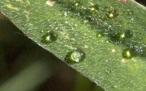
Jpeg likes to work in 8 pixel by 8 pixel blocks and any one block has no idea what the next block contains. This can result in the borders of neighboring blocks failing to match for color and density. As levels of compression increase, these blocks become increasingly apparent to the viewer because the “rebuild engine” in the software has less original information to work with and therefor errors will be greater.
The tiff standard had it’s birth in the desktop publishing world as a proposed standard amongst desktop scanning devices. It is widely accepted as one of the image format defacto standards for printing and publishing. The other being EPS. Many consider tiff to by synonymous with uncompressed or lossless compression. This is a false assumption. While the baseline (basic level) of tiff is either uncompressed or uses a lossless line level compression, a tiff file can also be a “container” for a jpeg compressed file. This jpeg-in-a-tiff scenario is subject to all the loss and limitations of any other jpeg file. So be aware that a file with a .tiff extension may not have all the integrity you are expecting.
Tiff’s early days were very limiting. The format supported only 1 bit of data per pixel – meaning black or white. No gray and no color. Over the years the tiff standard has expanded to support ever increasing bit depths and files up to 4 gigs in size. Files over that size use a format called Big-Tiff.
Just in case this whole file comparison thing is not quite “geeky” enough for you, here is a fun fact; The third and fourth bytes in a tiff file alway represent the number 42, which is a nod to “The Ultimate Answer to the Ultimate Question” in “The Hitchhikers Guide To The Galaxy” http://en.wikipedia.org/wiki/Phrases_from_The_Hitchhiker%27s_Guide_to_the_Galaxy#Answer_to_the_Ultimate_Question_of_Life.2C_the_Universe.2C_and_Everything_.2842.29
And they say programmers don’t have any fun.
The tiff standard has been expanded to include support for multiple “pages”. Just like a layered photoshop file. Adobe, who owns the rights to the tiff format, have taken advantage of this flexibility and allow layered photoshop files to be saved in the tiff container, alongside a “flattened” version of the file so that standard tiff reading applications can provide you with a usable composite image.
So I hear you asking: “Which one is best?” This of course depends on your needs. For general photographic and fine art pigment printing, file quality is a majority factor in the final print. Lossy compression means less than stellar printing. So use jpeg if you must, but compress it as little as possible. If you are using tiff, if you must compress, avoid using jpeg compression and go with line level compression. LZW for example.
Now if maximum quality is your biggest concern. Stop shooting JPEG in your camera, unless your raw files are compressed too. Many manufacturers only provide compressed raw. Check your camera specs. If you aren’t gaining anything by shooting raw, then go for JPEG and save the space. If you have an uncompressed raw or a tiff option, these will yield the best file integrity but take the most room in storage.
If storage space is your primary concern, then jpeg is your friend, at least until camera makers are willing to include lossless compression in their firmware, and it is unlikely they will until there is a demand for it. So if you think it’s a good idea, write your manufacturer and request it.
Want more on shooting Raw vs Jpeg? Check out my blog post on that topic here
Have a question? Put it in the comments below!


