A Pigment print is a bit more than just an inkjet print. So what makes it fine art worthy? To qualify, the print must be achieved using archival grade pigmented inks on archival grade fine-art paper or canvas. While we love the look of the watercolor papers and canvas papers we don’t suggest using Giclee “photo papers”. For aesthetic reasons, we recommend that the artist get a fine art photographic print for that. But the quality of the fine art pigment print is not limited to the inks and papers you use. There is quite a bit more that goes into the craftsmanship than just the print alone.
There is a great many details that should be tended to, but the major areas can be broken down like this:
Photography of your artwork
Working the file before testing
Generating a worthy test print
Working the file again to refine the proof
Printing the final units or series
Each of these is important to understand so they may become an effective part of your workflow. Since there is a great deal of information to pass along, I’ll split the content into a multi-part series.
Photography of art work
Every step in the production chain of your fine art edition is critical, but some steps, if improperly done, can be disastrous to the final viewer experience. The first step, photography of your artwork, is an excellent example. This step is the largest determining factor to the faithful reproduction of your original art. To create a great pigment print, the photography of the artwork should be:
- Focused properly using high-end lenses
- shot using a strudy tripod in a vibration free environment
- photographed using the sweet-spot of the lens
- in some cases, polarized light and or special lens filters may be required
- exposed correctly with a critical attention to detail
- evenly lit using the proper lights
- correctly white balanced
- shot in the proper file format and with sufficient resolution
- shot in a colorspace that is large enough to capture the full range of the painting and supports the full range of the Pigment print
The right glass
Shooting with inferior lenses may result in various distortions, such as smearing around the edges, chromatic aberrations – where some colors focus differently than others, barrel or pin-cushion distortion, lens flares and overall lack of saturation and/or contrast. Shooting with prime lenses and pro-level equipment will provide the highest possible image integrity and result in a file that achieves the closest honesty to the original.
 Chromatic aberrations of cheaper lenses result in out of focus images with color fringing. |
 Proper apo-chromatic focus results in all wavelengths (colors) focusing on the same plane for maximum sharpness and detail. |

Bottom photo clearly shows effect of apo-chromatic aberrations.
Distortions, or bending of the image are another issue with lesser quality lenses with “pincushion” and “barrel” being the most common. Pincushion distortion has the effect of the center of the image being further away than the edges while barrel distortion is just the opposite. With barrel distortion, the center of the image appears closer to the viewer than the edges.
 Pincushion distortion created converging lines towards the center of the image |
 Barrel distortion creates diverging line near the center of the image |
A quality image capture is not dependent exclusively on a good camera/lens combination.

A high quality pro level tripod is a must for the artist who is serious about photography of art, and they are expensive.
All elements in the photographic process are important. For example: how the camera and art work are handled during the exposure process will add a measurable difference to the final product.
A good solid vibration free tripod is a must-have if you are serious about photographing your own work. Any vibration in the camera or the original artwork during exposure will result in “motion-blur” that will visibly carry over to your reproduction prints. While lesser tripods may be appealing just because of their price, they are susceptible to vibration, “ringing”, sagging and slipping during exposure. Think of it this way, if cheapo gear would lead to professional results, then why would there be a need for “pro” gear, and why would the pros invest the top grade gear?
If you want to get the best looking print, and your are committed to doing your own photography of your art do yourself and your art buyers a big favor and use the gear that will get you fine art quality instead of drugstore quality.
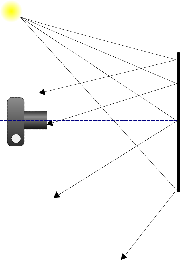
A stable support for your artwork is equally important. Any movement in your art during exposure will result in motion blur issues that will leave the image looking out of focus or double-exposed. While it may be tempting to take your art outdoors for the photo session, keep in mind that your painting is much like a sail in the wind. The slightest breeze will result in movement in the artwork. Heavier breezes or gusts may damage your art. And shooting with only one light-source, such as the sun, does not provide even lighting across the entire painting. I know this sounds crazy, but it has to do with what is called “angle of reflection” This is basically a measurement of the angle the light-path takes as it reflects away from the subject towards the viewer or camera and it is always equal to the angle of incidence (the angle the light path takes to get to the subject).
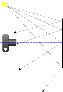
The propensity of light falling on a subject will reflect away at an angle equal to that of it’s source.
Light falling on your canvas is more likely to scatter in a direction away from the light source. So let’s take the example to the right. The light source, in this case the sun, is to the left of the painting and the camera is directly in front of it. As we move across the canvas from left to right, we have less light reflecting in the direction of the camera lens. This results in the right side appearing darker than the left. This is called “fall-off”. Our eyes and brains adjust for fall-off for us, so we tend not to see it with the naked eye. While much of the light will “scatter” off in multitudes of directions, it is not enough to eliminate fall-off.

Since our light source is high and to the left of the subject, the brightest area will also be high and to the left.
Shooting indoors gives you the greatest control over your environment for lighting and stability. When possible, setup your tripod on a concrete floor. Wood floors have flex and tend to amplify vibrations like a spring-board. If you must setup on a wooden floor, try to locate the load bearing supports under the floor and set your tripod in that area to minimize vibration. The farther you are away from the supports, the more amplified the vibrations.
Stay tuned for the next post in the series on Proper Lighting and Exposure. You can subscribe to our newsletter or via RSS to be notified automatically.
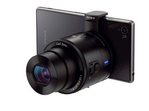 Smartphone photography has been lacking some important features – that is, until now. With Sony’s release of their QX Series “Lens Style Cameras” the camera-phone concept reaches new turf.
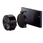
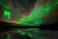 presentation on night-time
  There are many outstanding workshops available throughout the remaining 5 days and some are so promising they are virtually guaranteed to fill up fast.