|
|||||||||||||||||||||||||||||||||
|
|||||||||||||||||||||||||||||||||
|
|||||||||||||||||||||||||||||||||
|


How Colors are Created in the Digital World
This short basics post will prime you to understand how colors are specified in digital files. In the reproduction market, of which Reed Art & Imaging is a part of, we use digitally driven devices to make faithful reproductions of original art, photographic captures and digital graphic designs. To accomplish this task with any hopes of repeatable accuracy, there must exist a standard system by which colors can be recorded, transferred, translated and output. These standards exist in theoretical color models. These models are a virtual shape, such as a box, sphere. polygon or other shape that if it were real, would contain every color visible to the human eye.
![By SharkD (Own work) [GFDL (http://www.gnu.org/copyleft/fdl.html) or CC-BY-SA-3.0-2.5-2.0-1.0 (http://creativecommons.org/licenses/by-sa/3.0)], via Wikimedia Commons](https://upload.wikimedia.org/wikipedia/commons/a/af/RGB_color_solid_cube.png)
The RGB color model mapped to a cube. The horizontal x-axis as red values increasing to the left, y-axis as blue increasing to the lower right and the vertical z-axis as green increasing towards the top. The origin, black, is the vertex hidden from view.
Colors come to our eyes in two ways – or transmitted from a light source or reflected off of a surface.
RGB is called the “primary” space and it’s numerical system can be equated to the brightness values of transmitted light – or how intense the Red light, Green light, and Blue light are shining. As the numeric value increases, the lights get brighter and the closer to white they become. More on that in a bit.
In a CMYK model (the secondary space) we are representing pigments that absorb light. So as the number increases in their scale, the more light is absorbed. So with CMYK, the higher the number, the darker the color appears – exactly opposite of RGB.
In either space, the ratio of how the colors are blended determines the color, while numeric values contribute to how bright or dark it is.
For simplicity, the rest of this article will use only one color model. I’ll use the RGB model for these examples because it’s the model that our clients use and best supports high-end reproduction digital printing.
How Color is Expressed
Color is usually expressed in human terms by it’s
- Value (light to dark)
- Saturation (how close to pure is it)
- Hue (red, purple, green, yellow, orange, etc.)
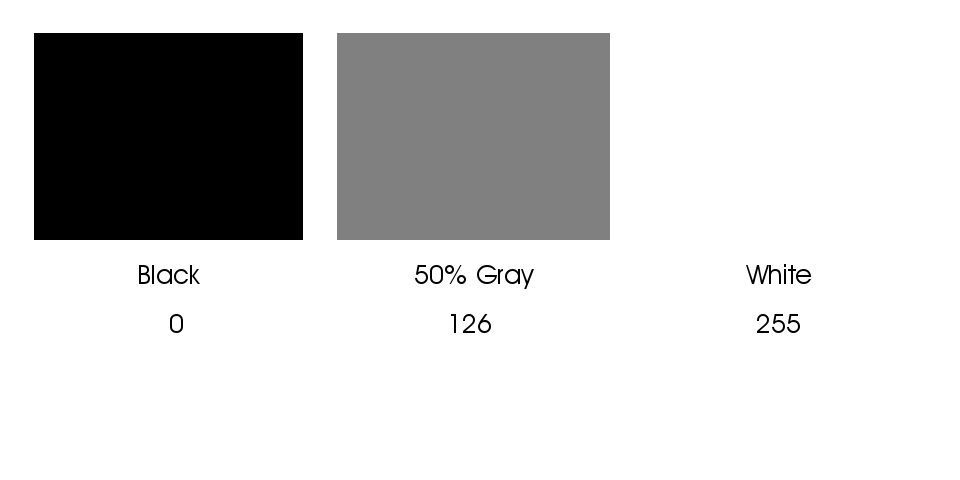
In the data driven world, it’s expressed as a recipe of the colors required to build its final value, saturation and hue. Image and graphics applications usually use the standard scale of 0-255 ( what is called 8-bit color) to represent the amount of each color present, with 0 being none and 255 being maximum. Dark colors being closer to 0 and light colors being closer to 255. Equal amounts of each color create neutral hues ( grays ) and as the numbers increase from 0 to 255 the value moves from black to white.
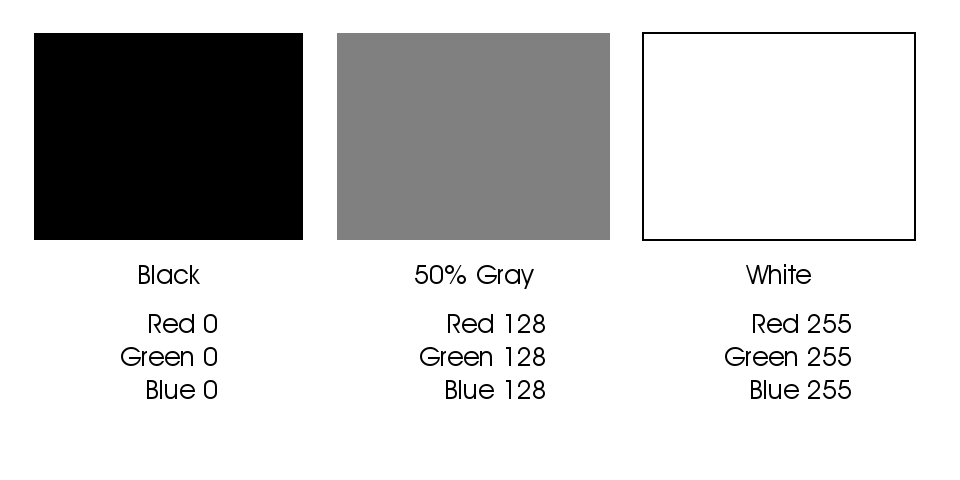
Darker values are closer to zero and lighter values are closer to 255
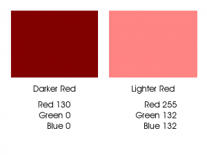
These numbers from 0 to 255 are called “Levels” and in our examples fall into a model of 256 levels – with zero being included as a level. In an RGB color space, each color is built using various levels, or recipes, of Red, Green and Blue. Dark Red has a different recipe than Light Red, and the recipes are different for a saturated versus less saturated red.
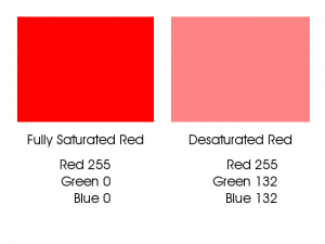
Fully saturated red is a different build than a less saturated red.
Dark Red has a different build than Light Red.
As you can see in the first example above, a fully saturated hue has 255 of it’s requisite colors and none of the other colors. As the color desaturates, it gains some of the other colors; it’s moving closer to a neutral gray. In the second example we can see that the Darker Red contains none of the other colors, but the Red number is dropping closer to zero; thus making it “blacker.” This darker red is as saturated as it can get at this present value.
A critical point to understand is that in an RGB or CMYK file, color and density are inter-connected. Meaning that any change you make to color data will result in changes to density and visa-versa.
The other primary colors are built in the same way, like this:
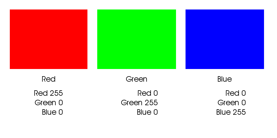
Color builds of fully saturated Red, Green and Blue.
The secondary colors are built from equal amounts of two of the three colors:
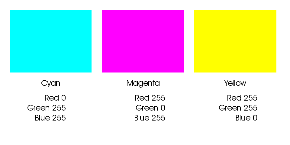
Secondary colors are built from two of the three colors
These secondary colors are thought to be the “opposite” colors to those in the previous example. You will notice their recipes are directly inverse. Red is R255 G0 B0 and Cyan is R0 G255 B255. They are opposites because when the two colors are combined, they cancel each other out and make gray. Equal parts of Red and Cyan make gray, same goes for Green with Magenta, and Blue with Yellow.
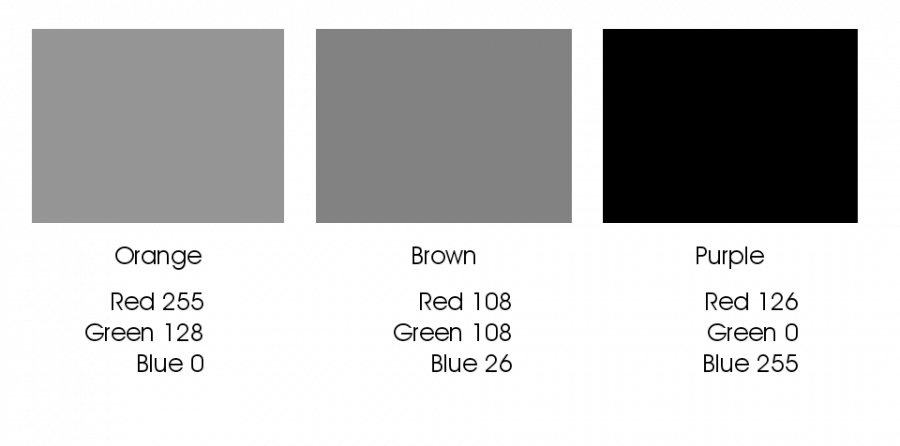
Intermediate colors such as Orange, Brown, Purple, Daisy Yellow, Lemon Yellow etc. are built by using various values of the three colors where at least one of the colors is greater than 0 and less than 255:
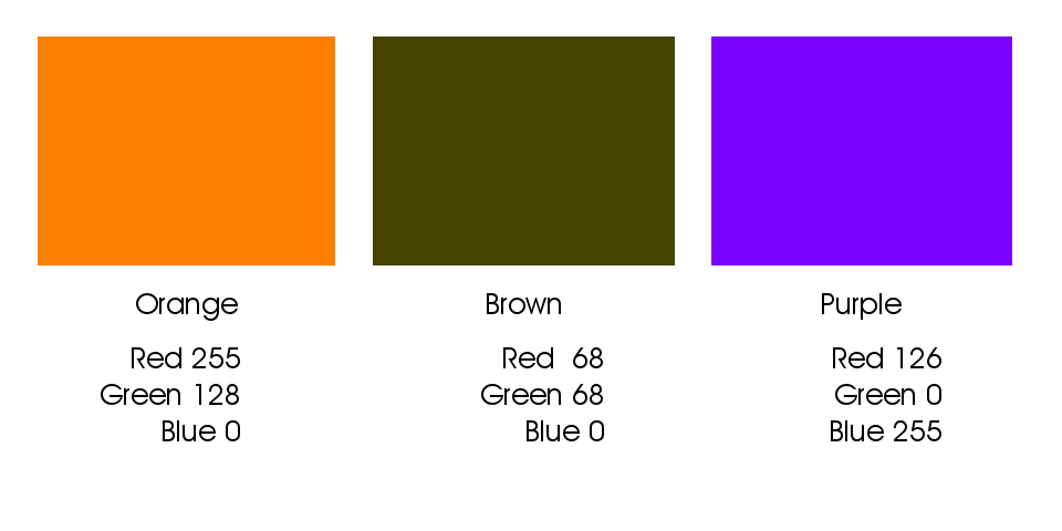
Intermediate colors result from builds using two or more colors.
This 8-bit model, using it’s 256 level per color channel architecture allows for approx 16.7 million variants of color and density. (256 x 256 x 256 = 16,777,216).
Other bit-depths exist that extend the number of available colors; the concepts are the same, but the numbers differ.
For example: 12-bit color – the depth that most digital cameras record in raw format, has 1,728 levels per color channel (instead of 256) with a total number of 5,159,780,352 available colors, much higher than present technology can reproduce in a print or display. The commonly used 16-bit depth has 4,096 levels per color channel with a total number of 68,719,476,736 available colors – yes that’s 68.7 Billion! While some professional pigment printers and their RIPs can support a 16-bit file, getting the subtleties from that many colors on paper and dots via a limiting 8 to 12 different ink colors is still problematic.
If you have questions, post them in the comments below. If you want to see how this all ties together with Photoshop channels, stay tuned, that’s next!
Photoshop Channels De-mystified
Color channels are often thought to be the exclusive realm of mystics and Photoshop gurus. If you are willing to dedicate a few minutes of time to learning, I’ll take the mystery out of channels, and give you the power to improve your workflow and your end results.
The colors we see on our monitors and in print are created by combining specific amounts of either Red, Green, and Blue, or Cyan, Magenta, Yellow, and Black with the result being a new intermediate color. Since the majority of our readers are using the RGB model, I’ll stick with that for our examples. If I get requests in the comments below, I’ll add a section explaining CMYK.
Most users of image editing applications like Photoshop or Gimp, as well as users of other graphic design applications are familiar with, or have heard mention of the 256 levels used to define color and density. Most often these levels are represented by numeric values from 0 to 255 with zero being one of the levels. In the RGB model, these levels can be equated with visual light, zero being no light, or pure black and 255 being maximum light – pure white.
The 256 levels represent visual density ranging from black through white.
When we build colors in the 8-bit RGB model, we are using 256 levels of Red, Green, and Blue in various combinations called a “build”. You can think of the color-build as a recipe for that specific color.
Intermediate colors result from builds using two or more colors.
Collectively the color channels are nothing more than a representation of those recipes. And when the recipes for all the pixels are put together in the right order, we have our color image. Viewing our color channels is effectively changing the way your cook-book is organized. So rather than finding the recipe for the pixels on one page of your cook-book, your color cook-book has three pages, one each for Red, Green, and Blue. The Red page tells you how much red to use and where, the same goes for the Green page and the Blue page. So in our example above if we assume that each colored square represents 1 pixel, the Red page would tell us the first pixel would have 255 red, the second pixel would have 68 red and the third pixel has 126 red. The Green page would read: 1=128 and 2=68 and 3=0 and so on for the Blue page.
Photoshop shows us these channels in a way that our minds can easily process: as images. We can grasp the concept of images much easier than looking at the potentially millions to billions of numbers required for single image. Photoshop’s default is to show you these images as various shades of gray (256 possible shades to be exact). Here is what our example above looks like as color channels:
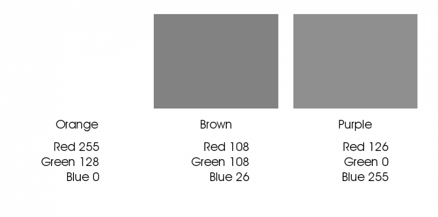
Red Channel
Green Channel
Blue Channel
Where the build calls for zero of a color, that channel represents the area as black. Where it calls for all of that color, it is represented in the channel view as white. All intermediate values show up as the appropriate shade of gray.
Real World Examples
This image is pretty much straight out of a raw conversion. The file has been optimized in the conversion to make sure that none of the channels contain either pure black or pure white. This is to mimic the way the eye naturally sees. We’ll compensate for its somewhat flat appearance when we show you how to optimize your files without damaging your color fidelity.
Full color view. This is called the “composite” view.
Here is the view of the red channel, remember lighter areas indicate more red, darker indicates less:
Red channel contents.
Here are the Green and Blue channels, you can click them for larger viewing:
Green channel contents.
Blue channel contents.
Notice that the lighter areas of the scene show as lighter in all three channels, and the darker areas of the image are darker in all three channels. You can also see that the areas of the image that are green show as brighter in the green channel in relation to the other two.
Also, all three channels have complete detail from shadows to highlights, nothing is lost. This is critical for full color fidelity. This full range of detail is essentially how channels should be. When channels look muddy or if there is “clipping” to full black or full white, there is a loss of color fidelity. I use channel views regularly to examine the state of a file’s “health”. If the file’s channels are not right, then I know right away I can’t generate the best possible print.
It is key to understand that in an RGB color space, a channel is both color and density information. Any change that you do to a channel will affect the color, saturation and density of your file. If you increase any value in a color channel, let’s say moving the red value of an area from 180 to 185, the resulting color will be more red and lighter.
See, no mystics required.
Reach out in the comments below with questions and comments.
Your Social Media Avatar Could be Killing Your Business
![Self-portrait by the depicted Macaca nigra female. See article. (Daily Mail) [Public domain], via Wikimedia Commons](https://upload.wikimedia.org/wikipedia/commons/thumb/5/52/Macaca_nigra_self-portrait.jpg/425px-Macaca_nigra_self-portrait.jpg)
Self-portrait of a female Celebes crested macaque (Macaca nigra) in North Sulawesi, Indonesia, who had picked up a photographer’s camera and photographed herself with it
Giving credit where it’s due.
Okay, I get it, right now your likely asking: “Why all this search engine stuff, I thought this was about the picture I use on-ine?” Well – it is, and all of the search engine stuff is a just a beginning to explain why your head-shot quality is important to your business survival. Gone are the days that your head-shot was just so humans could recognize you. Google wants to make sure that any good content you create is appropriately credited to you, and someone else’s junk content is associated with them and NOT you. According to video interview featuring Mark Traphagen of Stone Temple Consulting: part of how Google identifies your content is through facial recognition of your head-shot, and partly through other technical means – and the latter can lead to mistaken Identity. The better the headshot – the better the chances they will know it’s you while no head-shot at all could result in failure. This is not to say that your mug is the only way they know it’s you, but it ups the odds for accuracy. To keep things working smoothly, it’s recommended that you use the same avatar across all your social media accounts.
Who you are matters.
The first step in your customer’s buying cycle is to recognize they have a need. The second step is to learn how to meet that need – and preferably through doing business with you. Almost all the information gathering about a business, service or product starts on the web, and now, the great majority of it begins with a search engine. The search results delivered to the user is moving away from how well our website is optimized for keywords and towards deep dependency on what really matters to people: your reputation on the internet and what the user is actually looking for. How you present yourself online – i.e. the good and the bad of what you post, is added or subtracted to what others are saying about you in conversation and online reviews, to generate a reputation score. As David Amerland, author of the book Semantic Search so perfectly stated in an online broadcast via Google+: It’s a shame that it took software to make us behave online, but that’s the truth of what is happening.
And behave you should – assuming you care about the future success of your business. Google no longer sees your business as separate from you, but rather your business AS you. Post a ton of negativity on the web and your business can suffer as a result. All things that lead to you, or anyone that Google knows for sure contributes to your business website, blog, social media, etc. may be factored into your business’ online reputation scores. And you certainly don’t want a mistaken identity tarnishing your hard-earned reputation.
It’s all about you, and it always has been.
Increasingly your personal brand will factor into your business or your employ-ability. Prospective customers and employers are looking to social media and the web to learn about you before giving the green light to proceeding any further with you. It’s really just a matter of time before software emerges that can give the user a reasonably accurate estimate of your reputation score – along with those with whom you are competing. I estimate that soon your personal brand will carry as much weight or more than your résumé when decision time comes. If you change companies, your score goes with you, while your companies score remains with them. Your score could some day soon become a marketable benefit to hiring you.
Recognition for a company comes in the way of their logo, or a distinct appearance of their products. For you, this recognition comes in the way of your face. So in the very same way that a business keeps the same “visual identity” across all of it’s marketing, so should you. And just as well designed identity-package is important to a brand to build buyer trust, so is a well done head-shot important for your personal brand.
Expectations
Presently the generally accepted suggestions are this:
- Show your entire face, no close cropping.
- Both eyes are clearly visible.
- Good quality lighting – no direct sunlight and no back-lighting – soft light is great.
- The background is simple, of low contrast and clutter free.
- Selfies are just a bad idea if you want to elicit trust in your prospect.
- The picture should look like you. Yes it sound crazy, but we’ve all seen avatars that look little to nothing like the person when you meet them face to face.
- Hats, scarves, sunglasses are all strongly discouraged.
- Logos, text and other graphics are not visible.
A good head-shot is not out of reach for the budget-minded
Some pro’s will offer a discount to shoot your entire office or team in the same session. If you are a solo-preneur, call a pro and find out how many people you need to get a discounted rate and then call your friends, associates, or work out some other way of getting the minimum numbers you need. I suppose you could have your Ol’ Uncle Joe take the shot with your cell phone, but let’s be real, we can ALL tell the difference between a shot done by a “friend” and one done by a seasoned pro. You can bet your prospective customer can too. Purchasing only happens when the buyer has confidence. A not-so-great shot doesn’t exactly scream “You can trust me to do my best for you”.
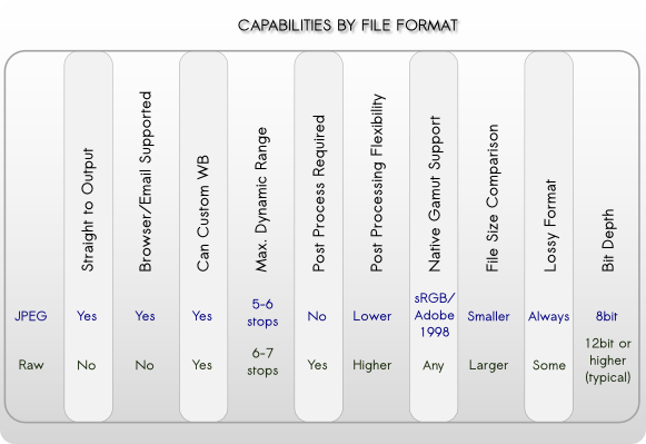
Raw Versus JPEG – What They’re Not Telling You
In the ever-present quest for perfection, photographers from around the country call me weekly with questions about shooting raw versus jpeg. The debate over this topic has been waging strong on the internet since the advent of digital still-image capture. Creating confusion, every photo blogger and “expert” in the forums has their opinions. Each of them expressing “this is the right choice”. Well today’s post is here to proclaim that it’s mostly bunk. There is no perfect answer that fits every photographer all of the time. The Holy Grail of file type is a myth and it’s time to stop looking for it and get on with the business of taking great images. The two camps in the JPEG versus RAW debate have strong emotional bonds to their “rightness” and are willing to go to great lengths – even as far as to embarrass themselves online while attempting to change the unchangeable minds of the opposing camp. They cling to the strategy of looking for evidence to support their case while ignoring the evidence of the other. In the end it just adds up to more confusion for the reader – who continues to be un-prepared to make their decision. If you are hoping this post will give you the right and perfect set-it-and-forget-it-forever options, you won’t find them, because I don’t think they exist – though you may find one that works for you most of the time. What you will find is unbiased data to help you make educated decisions before you enter a shooting scenario. You will also find enough data to see clearly why I made my bold statements against the “This is always the right way” mentalities.
Let’s get down to business
If you are a professional shooter, regardless of market you will likely have some of the following example criteria to consider as part of your decision making process:
-
- On what standards do your customersdetermine quality of service?
- How important is color accuracy?
- How critical is the pixel depth (megapixels)?
- Is dynamic range an issue?
- What are your expected turn times from capture to delivery?
- Technical issues
- Are you shooting under controlled lighting and can control scene dynamic range?
- What is the expected use of the image? Web, press, photographic, pigment, all of them?
- How large will the file be expected to print?
- Do you have time for custom white balance?
- Do you have time to verify exposure settings with a quality hand-held meter?
- Business related
- Do you see time as money?
- Are you paying assistants or digital artists to post-process?
- Are you paying your lab to color correct for you?
- What is your present customer satisfaction rate and is there room for improvement?
- Are you willing to spend some time, effort, and resources to impact product quality?
- Do you expect your workflow to minimize the post-process impact on margins?
- On what standards do your customersdetermine quality of service?
If you are a hobbyist, what are you looking to gain?
- The best possible print.
- To spend more time with family and less time with post-processing
- To gain more control over the final image
- To fit more images on the limited space of a card
- Technical questions:
- What is the subject matter?
- Under what conditions am I shooting?
- How will the image be used?
- What is your personal criteria for quality?
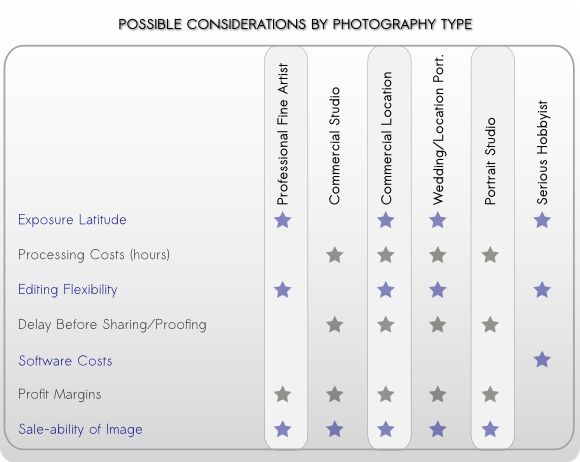
Perspectives – it’s all a point of view
Before choosing your shooting format I recommend you first determine your priorities and make a list. When you know what is important to you, then the best choices can be made and most often with higher levels of confidence. For these examples, we’ll look at the typical requirements of each shooter type. Knowing the requirements will lead to understanding why a certain thing might be a priority. Photographers and business models vary, so results and opinions may differ. For the pro, they have to satisfy an end user in order to make a living. Often working with pro level tools to maximize image quality and speed the process. For some of the professional markets such as studios, time is an expense against the profit margin and customer experience may have the largest impact. For other business models such as fine art, it’s often maximum image quality that is the primary target. Studios are the business model most likely operating in some type of assembly-line type of workflow. They have dozens of images from each person or product shot and each of these files needs some kind of attention. Usually starting with elimination of the unusable, then selection of the prime images followed by editing. The artists that are paid to handle this process are usually compensated by the hour. The longer it takes to move a job through the work-flow, the deeper the cut into the bottom line. Quality needs to be maintained to meet or exceed the customer’s minimum expectations. The average consumer’s expectations are often that the professional print should exceed the quality of a drug-store print. As long as they can see a higher level print, that particular expectation is met (photographic skills such as composition aside for the intent of this discussion). Skin-tones and most all other colors related to people photography fit will inside the sRGB colorspace. Studios have a great deal of control over their lighting, and thus the required dynamic range for the shoot. A good setup can usually hold within a 6 stop limitation of a JPEG work-flow. Interior location photography has additional challenges resulting from ambient conditions that might not be controllable. Office lighting, large windows, etc. can contribute to the overall lighting of a scene and may result in lighting ratios that exceed the 6 stop limit. In profit-centric people photography, merging brackets for HDR is rarely an ideal solution.
Commercial product photography has unique demands, especially when the product or person being photographed requires special staging and effects.
And yet the images themselves usually end up being used in the lowest of gamut conditions: 4-color press and the internet. In a complex shoot, where lighting, effects such as smoke or movement are in play, bracketing is not an option so maximum dynamic range is beneficial. In table top product photography – think catalog photos – there is no movement, lighting is completely controllable and product colors rarely exceed the basic gamuts of Adobe1998 or sRGB. Since the subject does not move, bracketing can be used to maximize dynamic range.. Food photography brings the potential for highly saturated colors that would do well with a larger gamut and maximum control. A commercial photo session often includes a day or more of styling, prep and active capture, followed by a similar amount of time in post. There are thousands if not ten’s of thousands of dollars at stake and final image quality can be critical to the customer’s end sales. Such diversity creates situations where JPEG would be most profitable and other times where a RAW work-flow is mandated. The fine-art photographer is often most concerned with image quality. They seek an integrity in the image that jpeg does not deliver. Maximum dynamic range, sharpness, color fidelity and detail are all sought in the persute of the ideal print that meets the artist’s vision and the expectations of the descriminating print buyer. Fine art images are often heavily manipulated to create the mood sought by the artist and to bring out maximum detail. Through manipulation, detail along with any compression artifacts will also be brought to greater light. Artists will often use improper white balance to enhance mood and emotional response. The artist will often spend countless hours laboring over pre-planning of a shoot, and many financial resources are spent on models and assistants. The final editing is usually performed by the photographer rather than an assistant.
Pick a card, any card…
Prepared with the insights you now have into the requirements of a few professional photographer types, these charts should help clarify why one format type won’t properly cover every photographer’s needs, and how some photographer’s might benefit from both types during their day.
| Basic Pros and Cons | ||
|---|---|---|
| Pros | Cons | |
| Raw |
|
|
| Jpeg |
|
|
A successful photographer will learn the needs and expectations of their client, then support those needs through technical and artistic know-how, all the while minding the needs of the bottom line.
You can help our readers by sharing tidbits you have discovered regarding JPEG and Raw workflows in the comments below. And as always, we are here to answer your questions.
Big Changes in JPEG Could Change Your Workflow
 The folks over at the Independent JPEG Group who have the job of maintaining all things technical behind the JPEG file format have added some much needed support to the oft-maligned aging file-type. With the release of version 9 of the jpeg software libraries comes 12-bit color support and optional loss-less compression; after all it wouldn’t do much good to have 12-bit color if you lose so much color-fidelity in the compression process. For the true geek in all of us, the new libraries are available for download should you want to try your hand at implementing them into your workflow. Be warned though, that unless you have some serious skills, implementing them in existing software will be a challenge. Open source fans on Linux and MacOS have the best shot at implementation at this time. You can grab the codec files from https://www.infai.org/jpeg/.
Camera Support
12-bit support should be a welcome addition for raw file shooters as the new standard will allow for full color fidelity in embedded JPEG previews and in-camera JPEG stand-alone files. This new wider-gamut support could result in JPEG being adopted as a viable workflow option for the serious pro. Adoption of the new standard will likely take some time in the commercial arena as the big software players and the camera manufacturers wait to see if the social-media buzz will add credence to the spend required for implementation. It’s my prediction that the early adopters will be open-source software and firmware authors – in part because their mind-set is usually quality instead of cost, and in part because their hands are not tied by corporate bankers, investors and bean-counters. It’s not uncommon for open-source software users to get some of the goods long before commercial adoption – as an example, Adobe’s content aware fill had been years-old news to GIMP users by the time Photoshop users heard about it. Frequency separation processes, de-blurring/de-motion tools and boutique sharpening algorithms could make this list as well as a good part of those were developed in scientific and educational circles and released as open-source, often years prior to commercial adoption. The new JPEG features could mean an short increase in digital camera sales as new models using the technology will appeal to a portion of the market. Users of major manufacturer legacy equipment might be out of luck unless you are willing to used a hacked version of the firmware, and assuming your jpeg codec is not hardware embedded in way that cannot be bypassed. Canon camera users will find the most mature firmware hacks over at Magic Lantern and CHDK. Nikon buffs can find a handful of hacks online, but none of them appear as mature and feature rich. A place to start looking if you are a Nikon fan might be the fledgling community over at Nikon Hacker. If factory firmware is your only cup-of-tea, then Canon owners might still have hope, as Canon has shown greater interest in supporting legacy equipment with feature upgrades. Nikon users will very likely be out of luck as the major manufacturer tends to release only bug-fixes for their firmware. As a Nikon shooter myself, I envy the attention Canon gives to the best-interest of their users. In the end, users of cameras that support raw, but do not support firmware updates should still be able to rely on software-based raw file conversion to get full JPEG9a support when it’s available.
Now the bad news
It appears that images created using the new codec will not decode properly on software that is using the older versions. This suggests that full implementation of the new JPEG codec into your workflow is likely to require new software in that one would not normally associate such as graphic design/layout apps, browser updates, thumbnail preview generators, operating system patches, even updates to your smartphone will be in the mix. My advice, don’t rush to adoption unless you have a very solid and critical reason to do so. Attempting to share a new version file with a client who has not fully adopted the software to handle it might lead to ugliness. I could find nothing in the new release that cannot be achieved using a different file format for most needs. For many years the Tiff format has fully supported the larger bit-depths and loss-less LZW compression. PNGs loss-less compression is already web-compatible and enjoys full browser support. Is the new JPEG version a potential game changer? Perhaps in a few circles. Those circles however will likely touch most any user of digital imaging; just not right away. When adoption is complete, the changes will be more of convenience than of consequence, but it’s nice to see the old JPEG standard get another face-lift to keep it current.
Call For Entries
 Looking for a place to show your stuff? If you are yet to be signed or you’re looking for new venues, a call for entry list can be a great resource.
Along with the calls listed below, here is a short list a sites to get you started. If you have a favorite, or would like your site added to the list, drop us a line in the comments below.
Gallery showings and events can be key to sales for the artists as the go-to event for art buyers. Openings and the ensuing sales are the life-blood of successful galleries. We’ve put together a few resources for the artists and the galleries that rep them.
Call for entry sites we think are good ones:
A few places to get exposure for your gallery:
These aren’t the usual places you list an art show, but the usual places might not be the first place the potential buyer looks. Adding these to your existing list can widen your marketing reach and increase buzz.
Yelp.com Yes it’s a review site, but their mobile app offers up a “Things to do in the area” list. Perfect for drawing in folks who are already out on the town and in your neighborhood. Ask your artists and your attendees to leave a review.
Foursquare.com Another mobile friendly way to bring locals right to your door. Encourage your artists and show attendees to check in to foursquare and leave a review. The more reviews, the better the exposure and the higher the traffic potential. The potential from crowd-sourced marketing is huge.
Have a site you want added to this list? Tell us about it in the comment section below!
Photo Contests:
OVER 150 PHOTO CONTESTS:
Show Off Your Skills & Earn Cool Stuff!
Thanks to Wendi over at wsphotodesign.com for sharing this one with us:
Have a site you want added to this list? Tell us about it in the comment section below!
Dang I Like Your Proportions!
 C’mon now, admit it. You’ve been faced with it too: Not knowing what print sizes your file will fit on without cropping.
The answer is all in the colon. No, not THAT one, this one ==> : These two quiet dots carry the full weight of the answer to the problem and it comes in the form of proportions.
Proportions, or “aspect ratios” are really just the comparison of one dimension to the other , ie. how height compares to width. When the proportions of your image, match the size you want to print, we say that it “pros out”. If it does not match we call this “fails to pro”. Pro, of course. being short-hand speak for “proportions.”
Proportions are used for many purposes in the graphic and photographic arenas, sometimes for technical reasons i.e. to fit a print size, sometimes for aesthetics – each ratio has its own gestalt – or feeling.
Images have their aspect ratios determined by either the camera or the cropping. For the purpose of our discussion, we are determining ratios to know if we will need to crop our image more to get it to fill all of a given print size. Cropping is required if the image aspect ratio does not match the print size aspect ratio.
Proportions are written as two numbers separated by a colon, such as 1:3 – meaning that for every 1 the other gets 3. So a print that is 1 inch on the shortest side would be 3 inches on the other side. Or an images that is 4 inches on the shortest side would be 12 on the other.
Note: officially when you verbally state a ratio, that little colon would be substituted with the word “to”, as in a ratio of 1 to 3. Now say this out loud: “1 to 3”. Sounds like you just counted to three right? Welcome to english where we have two too many toos to go around. Since a great deal of our customers are from around the globe, and we don’t want to risk confusion in a print order, we prefer to use the word “by” instead. As in “a 4 by 5 aspect ratio”.
The Basics
The aspect ratio is determined by reducing dimensionA:dimensionB to the lowest common denominator. Most print sizes will divide by 2 or 3 A few simple examples are a 4″x6″ print and an 8×10″ print.
Finding the ratio of the 4×6 would look something like this:
4×6 = 4:6 and the smallest number that these numbers can be divided by is 2.
4/2 = 2 : 6/2 = 3 No other whole number division can occur, so our aspect ratio is 2:3 or “2 by 3”
The 8×10 would go something like this:
8 x 10 = 8:10
Neither number divides by three down to a whole number, but we can divide equally by two.
8/2 = 4 : 10/2 = 5 No other whole number division can occur, so our aspect ratio is 4:5 or “4 by 5″
Let’s add another example: the 16×24 print size.
the 24″ dimension divides equally by three (3×8) but the 16” dimension does not (16/3= 5.33333) so we’ll try dividing by 2:
16 / 2 = 8 : 24 /2 = 12 and we get 8:12. We can take this further, yes?
8 / 2 = 4 : 12 / 2 = 6 and now we have 4:6 and we can still go down further.
4/2 = 2 : 6/2 = 3 No other whole number division can occur, so our aspect ratio is 2:3 or “2 by 3″
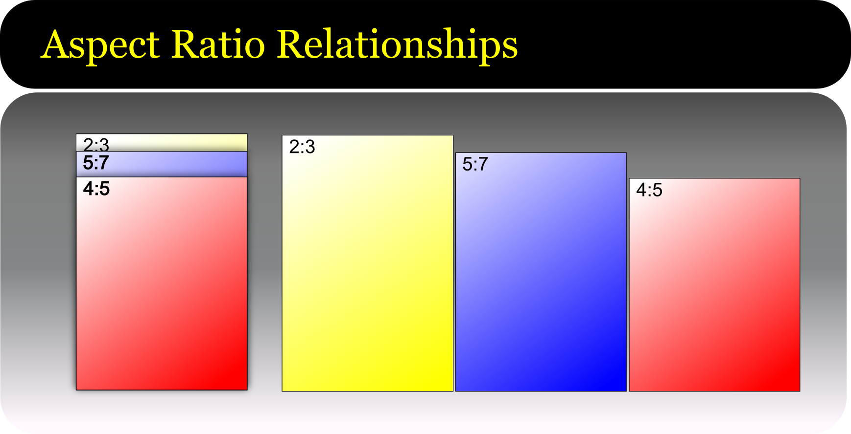
Now you might recognize that last one as the same ratio we determined from the 4″x6″ print. So our 4×6 and our 16×24 all have the same 2:3 aspect ratio. This means that an image that fits our ratio will scale to either size print without the need to crop off image area.
Some print and image sizes might need to multiply up to get to a good whole number. Let’s take a 2.5″ x 3.5” print – commonly called “yearbook wallet size”. These dimensions will not divide by the same amount to reach a whole number, so we must go up. Again, I’ll use the 2 or 3 rule first.
The number two looks like a good fit here:
2.5 x 2 = 5 : 3.5 x 2 = 7 for an aspect ratio of 5:7. These numbers won’t divide down further so we have our final aspect ratio.
Now that we have an aspect ratio, let’s look at what print sizes this will match without cropping:
5:7
x2 = 10″x14″
x3 = 15″x21″
x4 = 20″x28″
x5 = 25″x35″
etc.
These are not very recognizable sizes today, in part because this aspect ratio has not been used in cameras for several generations. The 5×7 print size still exists, but it does need some cropping for most modern images.
So let’s try this with our other sample aspect ratios:
2:3 is the ratio of 35mm, most DSLRs and digital hand-held cameras in the consumer market. Since it’s likely one that most of our readers will have had some experience in, let’s start there.
2:3
x1 = Standard wallet – 2″x3″
x2 = 4″x6″ – Your basic minilab/drugstore print
x4 = 8″x12″ – A common portrait print size. Note that an 8×10 would need cropping
x8 = 16″x24″
x10 = 20″x30″
x12 = 24″x36″
etc.
In this next example you’ll see some very familiar sizes.
4:5
x2 = 8″x10″ The single most popular enlargement size in the USA.
x4 = 16″x20″
x6 = 24″x30″
x8 = 32″x40″
etc.
Let’s answer a common question:
How do I know how much of my DSLR file will need cropping to fit a 16×20 print?
This is pretty straight forward. Let’s start with the short dimension.
So we have a 16X20 print and a file with a 2:3 aspect ratio.
Divide the short side of the print by the larger of the ratios: 16/ 2 = 8
Take the result and multiply by the longer: 3 x 8 = 24.
Result of 24 minus the print size of 20 and the remainder is 4
So this process shows us that if we enlarge the file to fit the short side to the 16″ dimension, we will have an extra 4″ of image area that will get cropped from the long dimension.
If the last step of the equation leaves you with a number that is smaller than the print size, then you need to begin again, this time starting with the longer print dimension.
Whew! Still have questions? Ask them in the comments below and I’ll do my very best to answer them.
Learn How Daguerreotypes Were Made

Daguerreotype of Louis Daguerre in 1844 by Jean-Baptiste Sabatier-Blot. Image courtesy of Wikipedia.com
Daguerreotypes are credited to be the earliest practical photographic process.
Louis-Jacques-Mandé Daguerre, inventor of the daguerreotype, was born on this day in 1787. Learn how were they were made in this short video by Getty Museum.
Lynn Goldsmith Gives Her Thoughts on the New Nikon Df
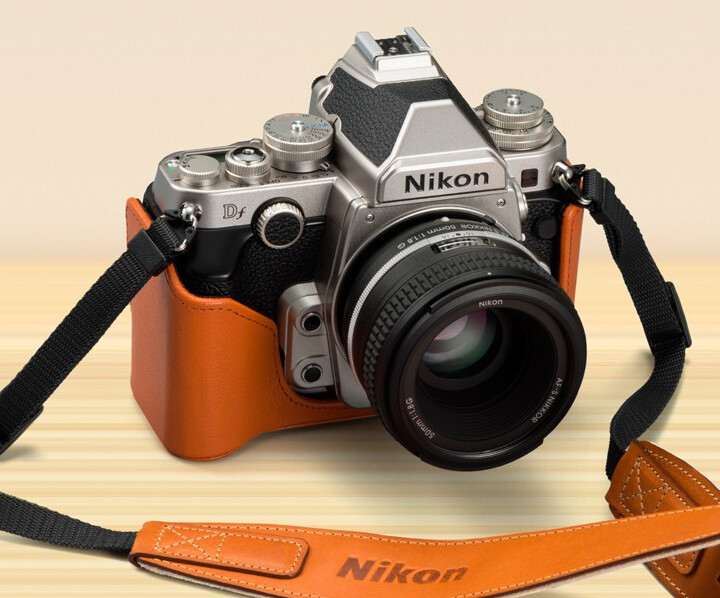 Nikon is now taking pre-orders for their new retro-styled full frame DSLR, the Nikon Df. The rugged good looks look back to an era that began with Disco and the Brady Bunch, and came to close somewhere in the 90’s when plastic construction became the norm. The body looks more F3 than D3. A look that I am sure many shooters such as myself who were active during that time will relate to.
 Nikon promises the new full frame sensor coupled with their new generation ExSpeed processor will yield amazing, low-noise images at ultra-high ISO’s in very low light. Nikon asked one of our fine art clients Lynn Goldsmith to offer her insights. Have a look at what Lynn has to say: